The Best Decorated Apartments And Houses In 2022
Due to their interior design, these are the domestic spaces that have conquered us in 2022.
2022 is coming to an end, a year marked by a health pandemic that has reminded us that the main purpose of our homes is to shelter its inhabitants. Throughout these 12 months we have published hundreds of spectacular and amazing housing projects located all over the world. Due to its unbeatable location, its design or its incredible architecture, this selection of modern apartments and houses make up our list of favorites of the year.
Example of Scandinavian aesthetics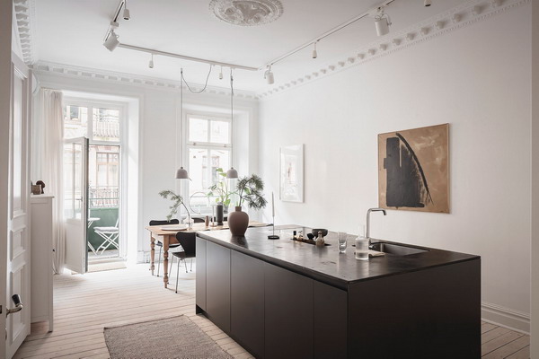
Housed in a 1902 building, this Swedish apartment has undergone a profound transformation, now sporting a radically new look and pleasant, subtle home décor. The authors of the reform have preserved the original architectural details in an act of respect for the work of the early twentieth century. The high ceilings, which favor the feeling of spaciousness, the stucco walls restored with maximum sensitivity and the new moldings created in the same style with which the house was built create a unique environment in which you can be inspired if you are thinking of creating a Nordic atmosphere at home.
Iconic Furniture Festival in Moscow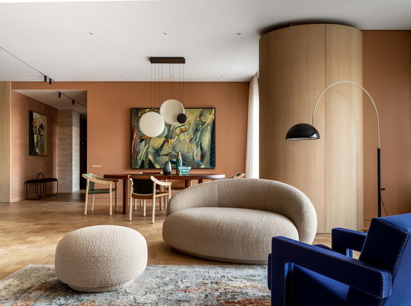
This stomp in Moscow has been achieved thanks to the addition of two floors. The result is a 340 square meter space in which the designer Agnes Rudzite has displayed all her talent. Inspired by the 1970s, the reform is a balance between sophistication and boldness. The creator has managed to create a comfortable and comfortable environment that does not renounce elegance. The fusion of iconic furniture pieces that mix eras and styles helps to achieve this.
Natural shades in Poland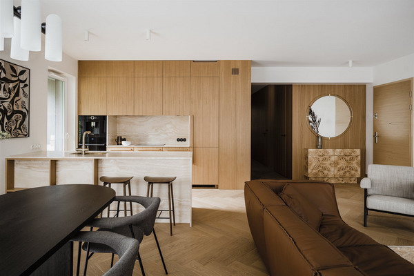
In Poznan (Poland) we have found the Botaniczna apartment where a surgeon and his wife live, in front of the medical clinic. The prestigious interior designer Agnieszka Owsiany signs this work that sought to create a residence that would generate a quiet environment and disconnect from the daily stress for the couple. The 90-square-meter house has been configured for comfort, thanks to a soft color palette and designer furniture that provides security. Simple and minimalist lines, use of noble woods and fluid transitions between the spaces mark the whole.
Updated 70s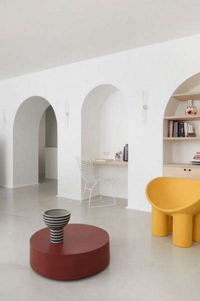
On a sober base, the Heju architects studio incorporates some notes of color to this apartment in the French capital. Honest materials, charming essential corners and handcrafted details determine this floor that breathes elegance. Wise decisions, poetic interventions and sculptural pieces add up to a brilliant result. On a sober base, touches of color have been added through the furniture, and all this on a sifted concrete floor that dialogues with the wooden ceiling of the rooms. In addition, Alvar Aalto’s footprint is present in all the spaces of the house…
History and art in Manhattan
A studiolo was a small private cabinet in Italian Renaissance palaces for the study of subjects related to art and science. And that is the setting that has been recreated from the Of Possible studio for the annexed guest space of the owner of the popular art gallery Splendid Peasant.in New York City Manhattan. An itinerant collection of furniture and objects from the gallery itself, specialized in American popular art, has been integrated into a 93-square-meter space, along with sculptures by artists Shana and Robert ParkeHarrison. The authors chose heat-treated black granite as the primary material, both for the kitchen countertop and for the tabletop, flooring and shower lining. Its leather-textured surface captures shadows and reflects light, presenting various effects throughout the day. Much of the furniture, such as the daybed, the coffee table and the dining room have wheels to reconfigure the space at will according to the changing decoration.
Mid Century Australian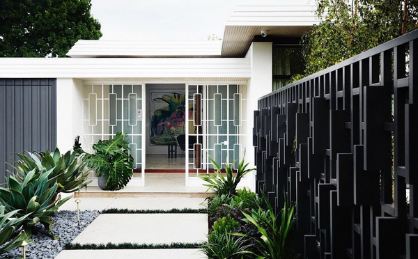
The Mim Design studio has banished the darkness that this Mid-Century style house in Melbourne (Australia) had and thanks to the large windows and an open floor plan it has allowed natural light to fill all its spaces. The original home, designed by architect Harry Ernest in 1964, caught the attention of publisher David S. Miller and his wife, who lived within walking distance. When it went on sale they bought it almost on a whim. The bedrooms were dimmed, access to the pool was difficult and, ultimately, the glow of its golden age had been lost. After a careful renovation, the residence shines with its own light.
Surrounding atmospheres inspired by Mexico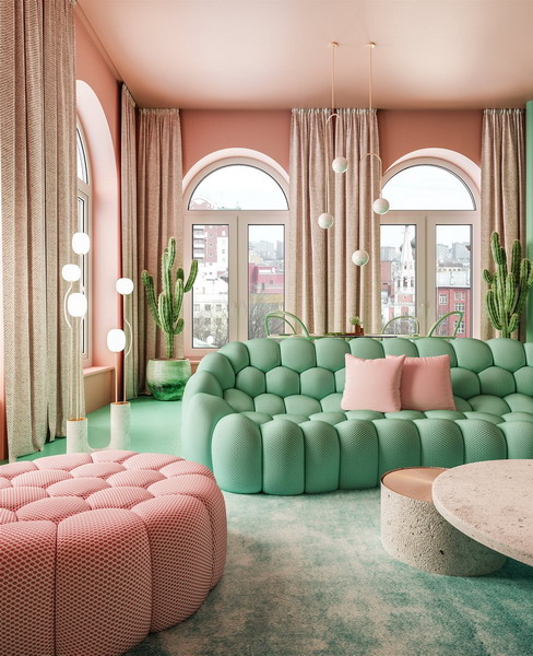
In New York we found this apartment, whose owners gave carte blanche to interior designer Dimitry Reutov, from Reutov Design, to create enveloping and cozy atmospheres inspired by the 1950s and by Mexican nature. Starting from the combination of pink and green, the interior designer painted the house and dressed it with pieces designed by himself. In addition, this New York apartment is enriched with pieces by authors like Philippe Starck and brands like Kartell and Roche Bobois. Would you like to enter?
The Nordic style that arrived in Brazil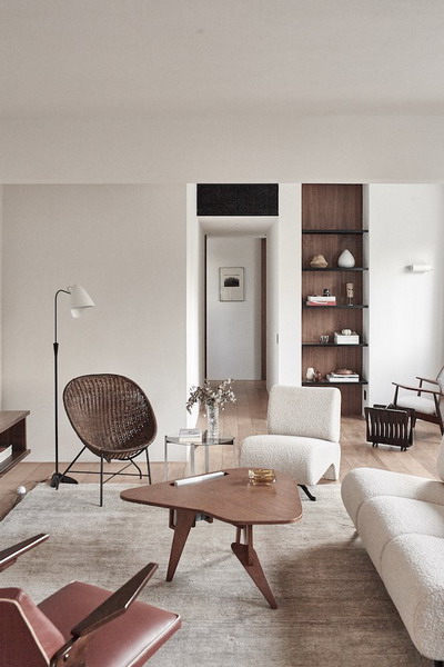
Of Greek origin and deeply linked to the art scene, he wanted more personal interiors that would make him feel comfortable in his home in Brazil. The authors of the reform of this house in the sixties are the architects of the PECLAT + CHOW studio, who created a new and different design in this construction located in the Jardins neighborhood of São Paulo. The old apartment with three bedrooms and one bathroom has been transformed into an essential and modern space, thanks to small interventions. Now, the owner lives in an apartment with a new palette of materials and enjoys the comfort of a large suite.
A garage converted into a Parisian apartment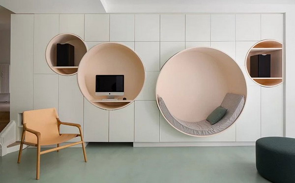
The French architect Pierre Louis Gerlier, based in the French town of Clichy, signs the renovation of this apartment that was the old garage of a house. The atelier responsible for the project has reduced the circulation spaces to expand the living areas and make them more comfortable in this house located in Neuilly-sur-Seine, within the metropolitan area of Paris. In turn, a second bathroom has been added, the master bedroom has been expanded and a custom-made geometric wardrobe in the living room designed for storage with white fronts that are cut by four circular structures in earthy tones that house shelves, a desk and a cozy round sofa. The color palette of the apartment is varied. While the living area opts for warm and soft tones, the kitchen opts for a striking yellow. The bathrooms, with the pink coating as a common denominator, adopt different styles depending on their equipment. Finally, Each of the bedrooms has a different color flooring that is complemented by the rest of the tones that color the rooms. The result is a charming apartment rich in details, bright and with personality.
Portuguese classicism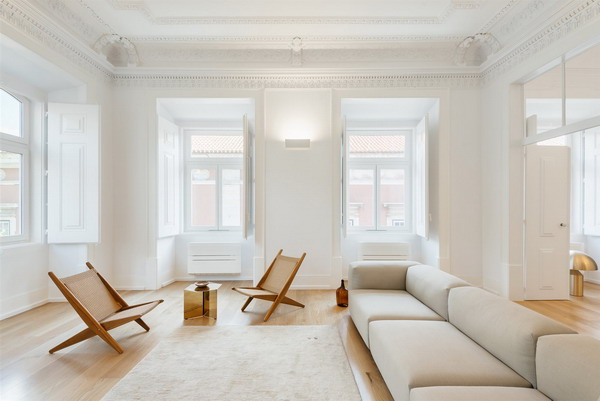
In Largo do Carmo, one of the most emblematic areas of Lisbon, we have found this apartment, a model of Pombaline architecture that keeps its essence intact. The Aurora architecture studio has known how to respect and value its past and has adapted it to a contemporary single-family home. The logic of the spatial distribution remains intact through corridors and direct connections between rooms. As only a minimal intervention has been made, the marks and the original state of the historic building have been recorded. And contemporary designs and elements have been added to the uniqueness of the historic building. The result is exceptional.
Pure and austere lines in Tokyo
The admiration between the Japanese firm Keiji Ashizawa and the Danish Norm Architects has led them to embark on the refurbishment of two apartments immersed in the Kinuta Terrace complex in Tokyo., a lung where you can breathe serenity and purity in the middle of the urban hustle and bustle. To dress the apartments, both studios have partnered with the Japanese furniture firm Karimoku Case Study, which has designed 12 pieces of custom-made furniture, inspired by nature, for the occasion. Wood, stone and concrete follow each other throughout the spaces, giving shape to designs of pure and austere lines with details inspired by the structures of Japanese temples and gardens. The result, pristine, is based on an original fusion of Japanese and Scandinavian culture where the quality of the materials and the timeless beauty of the compositions prevail.
Berlin in a ‘vintage’ key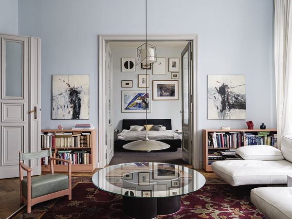
The trained eye of German interior designer Gisbert Pöppler allowed him to see a world of possibilities in this abandoned and run-down apartment in the heart of East Berlin. After the renovation, the house dating from 1890 is living history of Berlin, thanks to a selection of recovered furniture. Its creator has taken advantage of the patina of time, preserving certain original elements and adding new objects always in a vintage key. Entering the apartment is now quite an experience.
Contemporary luxury in Melbourne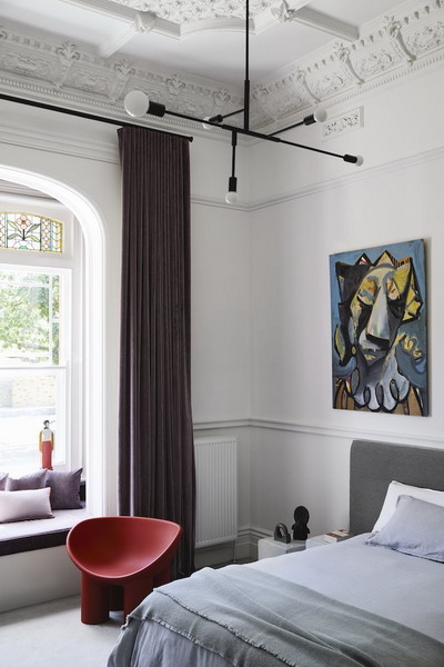
Knowing how to interpret the past is a skill that Studio Tate boasts, which has turned Armadale Residence II, an early 20th century house in Melbourne, into a current refuge that does not renounce its origins. From the hand of this Australian studio that has been able to interpret the space, respecting the mark of the past and incorporating the best of the future, the house has come to life. The incentives? High ceiling with moldings, large windows that illuminate custom spaces and a garden in which time stands still. The result is a house with its feet in the past but its head in the future.
Minimalism in a Lisbon duplex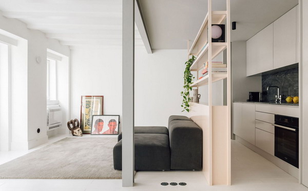
The Duarte Caldas.Architectural Design (DC.AD) studio has redesigned this 60-square-meter duplex apartment in the Portuguese capital, whose tight budget has not been an excuse to carry out a comprehensive reform, where a chromatic palette based on whites and gray, with a slight brushstroke in pink and finished in black. All the walls and obstacles on the ground floor have been removed to create a single spacious living room space. For this, the structure has been reinforced with a new system made up of metal beams and pillars. The functional distribution and minimalist style prevail throughout the house.
Bold colors on stage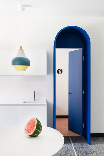
In Rome, in the heart of the Appio Latino neighborhood, a few steps from Caffarella Park, the Roman duo La Macchina Studio has transformed an apartment from the 50s into a surreal setting where reality and fiction coexist as in a theatrical scene. Thanks to the multidisciplinary approach of the two founders, the flat celebrates graphic design in a project that combines architecture, theater, music and illustration. In keeping with the tastes of the young couple of clients who love pop aesthetics, the architects have, on the one hand, recovered the pre-existing Venetian terrazzo flooring and completely altered the interior layout to make way for a new narrative. The result is a home as fun as it is cozy.


