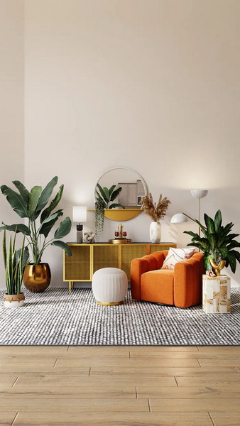
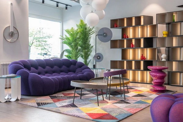
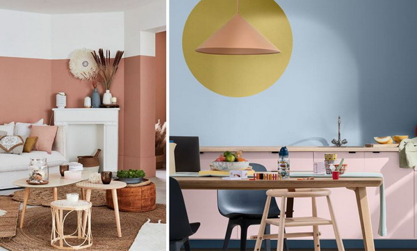
 The year 2024, in terms of colors, is very inspired by the seventies. The colors are bolder, stronger and more powerful and breathe character and dynamism into our interiors. They seem to want to shake up our universe and uninhibit our decoration with blues, greens and yellows, tangy and lively. It feels a bit like the world is waking up after a latency period due to the epidemic that turned our lives upside down. Even if neutrals and softer shades are always well established, stronger tones are essential!
Yellow shines in our interiors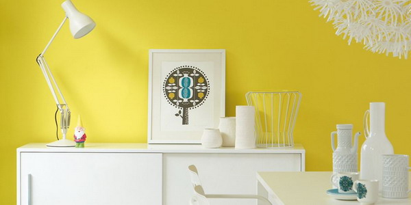
Yellow continues its ascent quietly in 2024. It may even last for many more years. If it imposed itself in slightly light tones, this summer, it returns in more seventies colors by relegating blandness and sobriety to the background. It becomes lively with a lemon yellow and goes as far as mustard yellow. It is present on the walls of the house for its very sunny, refreshing and tangy side, but also on the accessories and even certain pieces of furniture.
A lacquered burgundy for a noble touch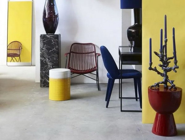
Burgundy is certainly the most unexpected color in this year 2024. It climbs to the top steps of the podium after having been forgotten for a long time. You will appreciate it even more in a lacquered version on small furniture, lamps or shelves. This elegant, sophisticated and racy shade will certainly seduce you. Between wine lees and red, burgundy has a slight hint of carmine red, which also occupies a prominent place in the decoration of 2024.
Green reinvents itself in 2024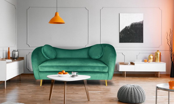
Green has always been present in our decoration, but it is making a strong comeback in 2024 in more invigorating and invigorating tones. It is their tangy version which today replaces the deep and darker greens, to breathe a breath of fresh air and audacity into our interiors. These tones adorn certain pieces of furniture to give them a more intense and charismatic life. It’s a way to bring vitality through a sofa, in the living room or a lamp, in the entrance or the bedroom. It also has the power to give a lot of modernity to lines that sometimes remain rooted in a certain classicism.
Klein blue: a fascinating color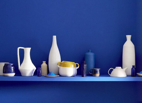
Klein blue is an extremely saturated ultramarine blue. Although it was created in 1960 by Yves Klein, it remains just as enigmatic and magnetic today. It adds a terribly seductive note to your interiors. Designers use it on small pieces of furniture as well as on larger pieces, but it can also successfully adorn a wall. This color harmonizes perfectly with different shades of white, from the purest to the most elaborate. It is equally at home with natural, neutral, understated tones and softer greens and blues.
Horizon blue: 2024 flagship color of the Dulux Valentine collection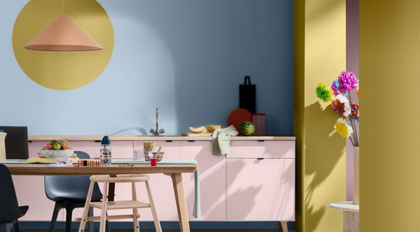
As if to contrast with the tonic and frank colors of this year, Dulux Valentine creates a more subtle and soft horizon blue which brings a lot of freshness to your rooms. It is also THE color of the year for this publisher. This softness offers beautiful perspectives, especially when combined with other tones. This is certainly what can appeal to color lovers who prefer to stay in easy-to-use shades. It easily goes well with a powdery or pastel pink, but also with a green verging on yellow or a carmine red, worked with small discreet touches. Enough to prolong the craze for natural shades, inviting you to travel and daydream.
Brown for its different variations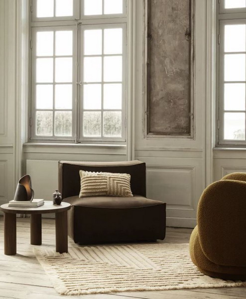
Brown had already made a somewhat timid comeback in recent years, in 2024 it is the big winner and triumphs in different shades ranging from characterful brown to dark beige, via camel. It is unanimous in taking up the codes of the seventies. It has become like a symbol sending back several decades. This color is essential in particular on the various velvet seats to which it brings consistency and allure. It accentuates the reflections of this shimmering material. It undeniably warms our spaces by bringing them a real dimension of comfort, appreciated all the more in these uncertain times. It is a safe and reassuring value!
Soft green
Sage green is undeniably a key color of the year 2024. It is also found at Dulux Valentine, under the name of olive branch, as well as at Sico or Benjamin Moore. It is essential, inspired by the need to escape and the return to nature. The advantage of this shade is that it can be placed anywhere from the kitchen to the living room to the bedroom or the bathroom. It has an imprint of undeniable softness and it has relaxing and soothing virtues conducive to calm or rest. One of its best friends is the powder pink with which it harmonizes perfectly, accentuating the extreme softness of these two shades.
To see life in pink
Pink is also popular in 2024 in all its tones, from the brightest to the softest and pastel. A raspberry pink invites indulgence in the kitchen. Whether on the walls, on the seats or on a piece of furniture, pink definitely settles in your living space, in lighter and more pastel shades. We particularly like its very positive side. You also decline it in pretty patterns, full of delicacy on textiles, accessories or wallpaper.
Lilac makes a sensational debut in decoration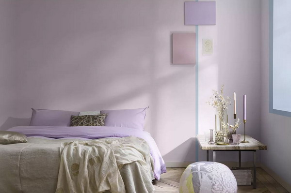
It is a very present color, but which knows how to be subtle and discreet. This purple in a pastel shade evokes the pretty flower of the same name. She knows how to integrate perfectly with all your rooms by bringing sensuality to your spaces. In 2024, this shade challenges us and hooks us to also give a little mysterious touch to the room. We love the softness and subtlety that characterizes it.
Mineral shades for the natural side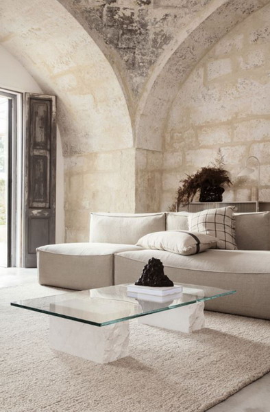
The mineral shades draw their inspiration directly from nature. They are found in different tones, from ocher to terracotta, through off-white or beige. These colors flirt with the movement of the slow life which continues in 2024. The return to the sources is anchored durably in our interiors with more erased nuances.
Nudes are still in the spotlight in 2024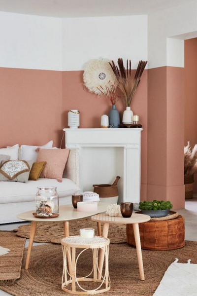
Nude is still available in a very varied palette in 2024. We appreciate it for its natural softness and a slightly feminine side that still appeals. These tones are perfect for the bathroom, living room and bedroom in particular.
Gray for its timelessness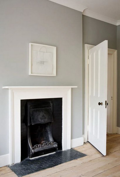
This timeless color has no equal to highlight and sublimate other shades. Even if it is little mentioned, it nevertheless remains essential in our interiors. From the darkest shades to the lightest shades, gray easily dresses walls and objects in all decorative styles.

