The dreary winter is slowly ending, and we are hurrying towards spring in great strides. At last! In terms of color, we can expect a happy, colorful season in the coming months, which makes us want to update the colors in our homes. This article will reveal which spring color trends are popular and how best to style them in your home. Let yourself be inspired by the tips and ideas of our interior experts!
Bye-bye winter! Color inspiration for your home in spring
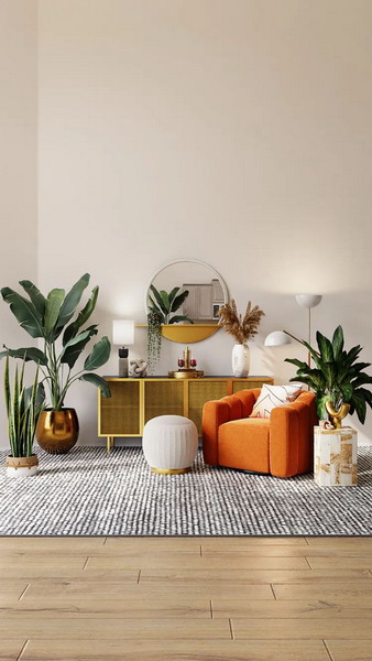
We present our little guide to spring paint colors for your furniture, decoration, and textile purchase! A strong, vibrant color palette shows your desire for positivity and bright, happy colors.
These are the trends:
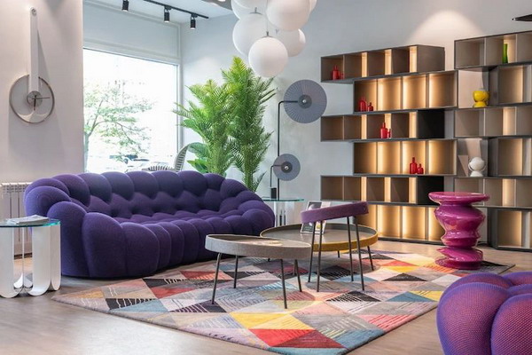
- Courage to color
- Tone in tone
- Colors of the sea
- Pastel tones plus white
- Delicate blush
Color Trend 1: Turquoise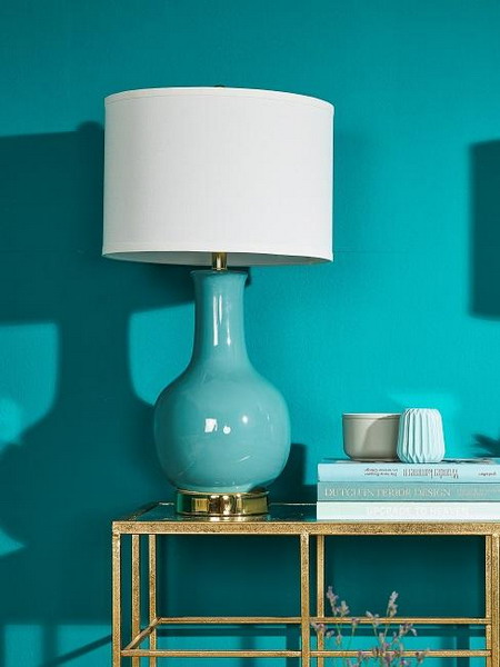
As soon as spring arrives, turquoise puts us in a summer mood. The bright nuance between green and blue makes us dream of Caribbean beaches, fruity cocktails, and relaxing afternoons by the pool. Bring summer into your four walls with spring colors from the turquoise palette!
That is What Makes Turquoise a Spring Color
Turquoise is fabulous for almost every furnishing style. Its cool and refreshing effect and bluish shade fill us with peace and happiness, making turquoise the ideal shade for the bedroom.
Cream, gray, and natural tones always go—even with turquoise. For a modern look, white, wood, and a dash of black are particularly outstanding. With a suitable silver decoration, the teal gets an additional noble touch.
 Color Trend 2: Sun Yellow
This spring color trend makes you happy: sun yellow. A warm yellow-orange makes you want summer, sun, and palm trees. Hach, we’re wallowing in the best vacation memories. By the way, yellow can perfectly combine with intense pink and blue tones.
This is what makes the spring color sun yellow.
The color yellow associates happiness and zest for life. At the same time, the invigorating nuance is reminiscent of juicy lemons from Capri and pure sunshine. So, if there is a color that stirs up the desire for the first warm days of spring, then it is a bright, sunny yellow.
How to combine Sun Yellow
Yellow and turquoise are an almost inseparable color combination and can only be used with pleasure in spring. In contrast, a classic sun yellow with neutral beige and greige is convincing. A stylish eye-catcher for yellow is home accessories in silver metallic or cool gray upholstery in front of yellow walls.
Color trend 3: Coral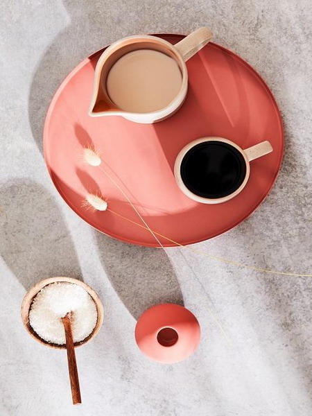
The next nuance should not be missing from our top list of spring colors. Coral was already the trend color of 2019, and we don’t want to say goodbye to the warm orange color this season, either. Fortunately, we don’t even have to! We see Living Coral everywhere as the spring color.
That is what makes the spring color coral.
The trend color coral looks as different as the natural coral reef in the sea: sometimes it is a bright orange mixed with a hint of pink, sometimes very gently with a delicate pink. An intense coral red gives your walls an exciting touch and can be used as an accent color.
How to combine coral
Coral complements natural materials and can be combined with natural colors. White, taupe, gray, or sand look particularly significant. Green tones can also enhance coral’s freshness. With the colors of the sea, warm orange gets a summery touch.
Color trend 4: pink & bright neon pink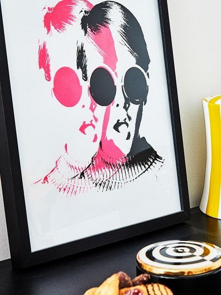
Too girly? Although this spring color was outraged a few years ago, bright (neon) pink is finally conquering our interior hearts. This bright nuance also puts you in an excellent mood. It’s an absolute must for spring and summer!
This is what makes the spring color pink.
Pink is anything but cheesy—on the contrary! The color Pink is convincing, has an expressive, stimulating property, and strongly affects the human psyche. Pink strengthens positive feelings, soothes aggressions, and makes you more balanced and calmer.
How to combine Pink
Red and pink are not in perfect harmony? What a crap. Who, like us, relies on a rich pink and a bright red tone to give his home a summery, fresh mood. In combination with Bordeaux, however, a matt pink looks elegant and sophisticated.
Color trend 5: Sage Green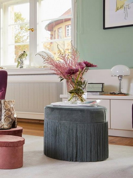
As a spring color trend, sage green conquers spring with its atmospheric combination. The mix of gray and green, a “dusty green,” looks classy and calm. It is perfect for a harmonious ambiance in your four walls, where you feel at home.
This is what makes the spring color sage green.
Like the classic green, the sage tone stands for hope, vitality, satisfaction, and naturalness. At the same time, the gray-green exudes an unobtrusive, matt look, which is particularly beneficial for a relaxed mood. Sage creates a cozy atmosphere in the living room and bedroom and, as a wall color, can positively affect concentration. Sage green goes well with a modern style of comfortable and casual furnishing.
How to combine sage green
Combine bright colors with sage green to support its natural effect. White, cream, and beige create a harmonious, calm color combination that looks sophisticated. This interaction also gives sage stylish luminosity.
Color trend 6: Bordeaux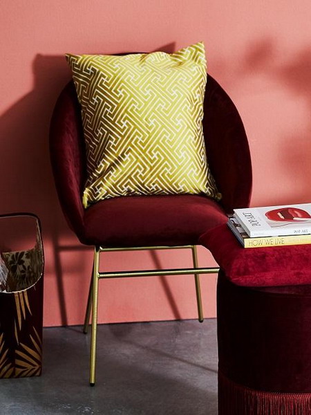
Autumn is not the only season with bright colors; in spring, too, a strong Bordeaux can be seen. We are impressed by the elegant tone with a slight touch of violet, and it is perfect for everyone who prefers darker shades and a noble ambiance, even in the sunny season.
That is what makes the spring color Bordeaux.
Bordeaux belongs to the color family of red tones and stands for love, passion, romance, and warmth. A colored wall and individual accents in the dark shade appear noble and sublime. The stylish red shade radiates warmth and comfort in your rooms without causing too much stir.
How to combine Bordeaux
Courage to color! If the dark Bordeaux is a bit too strong in spring, countermeasure with nude and furniture made of light wood. This modern combination means that the skin color does not look too bare, and the Bordeaux color is not too gloomy. You can also set trendy contrasts with home accessories made of black metal.
Color trend 7: Shell Shades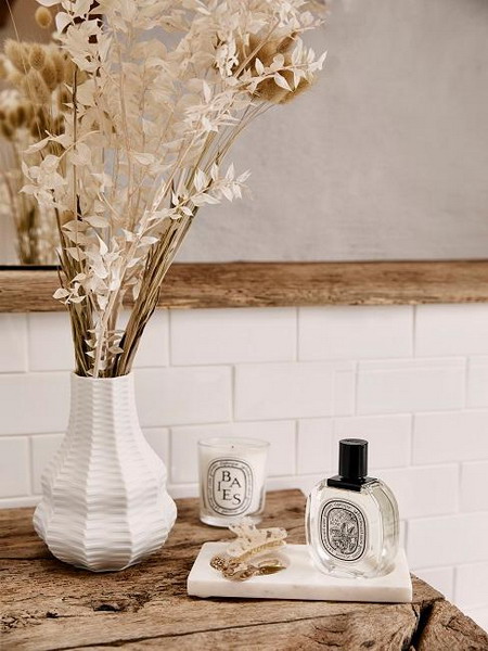
In spring, magic shell tones should not be missing from our interior. In terms of color, you are spoiled for choice here and can choose between different shades. With its shimmering colors and delicate tones, it is no wonder that shells are a popular souvenir of the last visit to the beach.
That defines the spring colors white, beige, and cream
No matter whether white, beige, or cream – the cool shell colors stand for neutrality, but at the same time, they also embody something feminine. White and cream are welcome to be chosen a bit cooler this season, while beige can still tend to gold – even with soft sparkle elements.
How to combine the shades of shells
The combination of white, beige, and cream lets us indulge in sunny vacation memories. The icing on the cake is the addition of individual elements in gold – wonderful! The feminine shell colors match every furnishing style and can be stylishly arranged for any occasion.
Color Trend 8: Classic Blue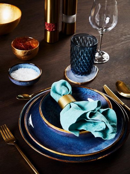
The Pantone Color Institute offers a top-class trend color for spring: Classic Blue. With this very special nuance, everything is in the sign of the sea this year—including a relaxed holiday feeling!
That is what makes the spring color Classic Blue.
This year’s spring color, “Classic Blue,” stands for peace, harmony, and security. Thanks to its simple elegance, the intense shade of blue is thoughtful and calming. At the same time, the nuance conveys joie de vivre and optimism. Well, spring can come!
How to combine Classic Blue
Classic Blue is excellent when mixed with fresh accents in white or elegant metal tones. This creates a stylish and cozy flair in which you must feel comfortable. Those who love the maritime look can combine Classic Blue with white and red in a classic way. This style looks a bit simpler with creamy tones or a warm beige.
Color Trend 9: New Lilac Tones
Spring has a lot to offer visually. We were particularly drawn to a specific type of flower: lilac. This season, the delicate Lilac adorns colorful spring bouquets and the home’s interior.
That is what makes the spring color lilac.
As a spring color, Lilac is straightforward and can be combined more quickly than you might initially think. In addition, the purple shade is delicate, feminine, and timeless. Lilac is not limited to a single color but includes a complete range of tones. From delicate, fairy purple to rich violet, the lilac shades are at least as versatile as the blossoming model of nature.
How to combine the spring color lilac
Of course, Lilac with white and pink can be pretty girly. However, the delicate spring color is best used with so-called non-colors. Gray and black are particularly popular—the perfect basis for your spring-like decor.
Color Trend 10: Pastel Shades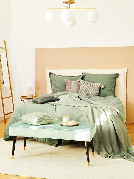
With a hint of powder, you can give your four walls a stylish freshness without being too thick in color. Pastel tones are the perfect combination partner and can be used individually and globally in the room.
That is what makes pastel shades.
Soft pastel shades ensure a feminine living style and set exciting highlights in your home. Even purists can implement pastel colors in your interior with style. The mix of colors in the cotton candy chic and clear lines creates an exciting contrast that breaks through pastel loveliness and looks pretty casual. Depending on the choice of color, a different look is created, which can be combined with a wide variety of interior trends.
How to combine pastel shades
Pastel is not the same as pastel! For this reason, the different nuances can be combined modernly. Dark wood and black harmonize perfectly with a powdery, gray rosé. Instead, light blue suits white and light wood tones—as does a delicate yellow or light gray.