Furnishing in an old building: five furnishing ideas
The prices for old apartments continue to rise sharply. Here you will find tips on what the furnishings in an old building can look like and what should be taken into account when renovating your dream apartment.
Furnishings in the old building: retain the charm
It’s done, the rental agreement for the dreamed old apartment has been signed. Now you can start setting up! Or is it about renovating your long-standing apartment and adding new furnishings? In any case, it is important that the charm of such an old building is always retained. Nobody should have arches removed by overambitious craftsmen, and beautiful wooden floorboards should not be covered by laminate or a thick carpet. It is better to set accents that draw attention to the most important and beautiful details of the apartment.
The typical characteristics of such apartments should be preserved and presented in the right light. Of course, no one has to show their love of old buildings by foregoing any chic: a mix of styles is also possible! Do-it-yourselfers bring something modern into the old building and show with the furnishings that they can get involved with different eras and ideas. Nevertheless, everyone should retain the ideas that classicism and art nouveau once brought with them and let them come into their own.
However, what is really necessary in many old apartments is a few revisions. The former workers’ apartments often have thin walls and poor insulation. The floor plan may not always seem obvious or sensible, but it can often be used to create great living concepts that represent the wonderful architecture of the apartments and still enable modern living.
Five tips for furnishing in an old building
-
Tradition and modernity when furnishing the old building
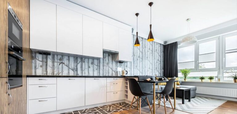
Many old buildings shine with stucco on the walls or ceiling. This is certainly not for everyone, but this typical feature of old apartments should be preserved. If you don’t like it, you can use it as a highlight and use it to decorate just one room when remodeling. Or part of the wall, the remaining walls are plastered white. The stucco is only allowed to show in selected areas and can therefore be more easily integrated into the planned mix of styles. The kitchen offers an example of such a mix: in the old building, part of the wall can be exposed, it is simply designed in white. But in a way that still allows the bricks to shine through. This wall can replace the kitchen mirror that is placed in the stove area, but it must then be wipeable. The furnishings themselves consist of modern to futuristic-looking kitchen furniture that is arranged in a semicircle or that does not just hang along one wall as usual. A counter loosens up the room, as does a kitchen island with an extractor hood. Here, modern furniture and “old” Designing the walls creates a contrast that makes the whole thing interesting and homely. You can also implement a few decoration ideas, but they should not degenerate into setting up a kitschy hodgepodge. It is also possible to display a highlight: How about a light blue light strip that shines under the furniture? Great effects can be achieved with lighting in particular , although the aim is not always to actually provide more light.
The furnishings for an old building should definitely underline the charm of the apartment.(#02)
-
Furnish old buildings and preserve the wooden floorboards
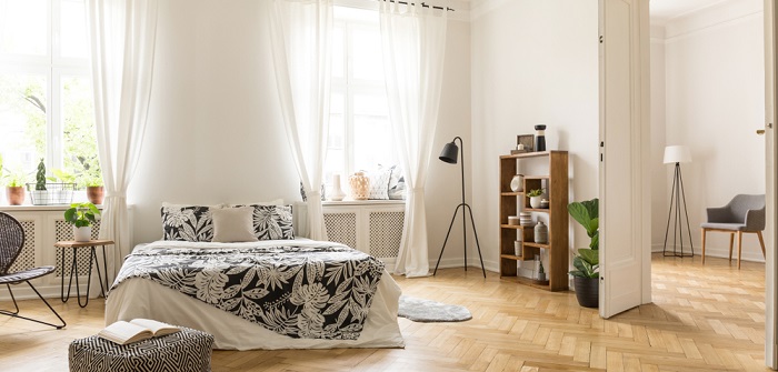
This has happened to many a tenant in an apartment in an old building: Out of curiosity, the firmly glued carpet was lifted in one place and what was visible there? That’s right, beautiful wooden floorboards! These are far too good not to integrate into the furnishings and instead cover them up with carpets or other floor coverings. Rather, they should be sanded and re-polished and give the old building its very own charm. They are the counterpart to the stucco mentioned and show that this is an apartment with a long history . When furnishing, do-it-yourselfers should therefore make sure that the wooden floor is polished up again by an experienced craftsman or on their own and then at most with a small carpet cover up. This can serve as an eye-catcher in the room or is suitable in the living room for extra coziness. Together with the other details of the apartment, this creates a warm expression that can also be seen in the numerous furnishing ideas in pictures . This is where love for old buildings shows itself at its best!
Living in an old building only seems truly authentic when all the furnishings are right. (#03)
-
Old doors preserved when furnishing
Many old buildings still have the typical double doors that were installed everywhere when the apartments were built. They are often not particularly attractive to look at, especially in buildings that are not well-maintained, they are no longer on their hinges properly or the paint is peeling off. It is precisely such double doors that create a stately ambience and show that someone with style lives here. Imagine walking through this door that opens on both sides and receiving guests in the salon! The apartment isn’t so big that it has a salon or a large living room? Nevertheless, the doors should receive special attention when remodeling or renovating. These should fit into the image of the old building, which with its floorboards and stucco looks like an image of a stately living space. It combines some decoration ideas that fit into modern times. Please don’t overdo it! If you surround yourself with too many little things, you miss the chance to make the apartment work for you.
It’s done, the rental agreement for the dreamed old building apartment has been signed. Now you can start setting up! (#04)
-
Shabby chic or modern?
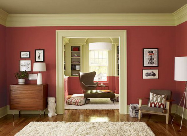
Living in an old building only seems truly authentic when the entire furnishings are correct. This in turn should be an image of your personality and reflect it. This means that even if the apartment owner concentrates entirely on keeping everything original and furnishing the apartment in a way that is clearly reminiscent of earlier times, it should not be forgotten that they want to live there themselves. This means that the furnishings can also come from the Classicism or Art Nouveau period if the apartment owner feels comfortable in it and finds it chic. But not many people want to live like that anymore and prefer a modern style. Shabby Chic is the solution and can be integrated into individual rooms or as a highlight in any room. The furniture looks used without being “worn”. It comes from other eras and still looks modern. If you don’t like that, do the same for the entire apartment as described above for the kitchen. The apartment itself is left original: stucco, floorboards and doors are restored so that they look like they used to. But the furnishings with the various furniture are done in a form that is more reminiscent of today’s times. Functional furniture, a futuristic style or certain details in the decoration that clearly show that someone from a modern world lives here: all of this leads to a combination of old apartment and modern furnishings, which represents a “lived-in old building”.
When setting up, you should therefore make sure to have the wooden floor polished again by an experienced craftsman or yourself. (#05)
-
Don’t forget the hallway when designing
The hallway in particular is often forgotten when furnishing an apartment: the shoes are right next to the door, so that the next visitor will actually trip over them. The jackets hang disorderly on the coat rack and, in the worst case, form a kind of mountain. There is another way to design the hallway as an inviting entrance area . Corridors in old buildings are often rather narrow and shaped like a kind of hose. The reason: In the past, hardly anyone valued this room and as a mere entrance area it simply took up space. Today the hallway is also a living room and is intended to welcome guests and of course the residents of the house. In order to widen this narrow room a little, it can be decorated with the typical checkerboard pattern that we know from many old apartments. This is possible, for example, with tiles or a carpet with this pattern. It is important that the hallway appears very bright overall so that it appears larger. This in turn means that large and heavy pieces of furniture should not be placed here. Rather, it is important to choose graceful furniture that still fits into the style of the apartment. A large mirror with a wooden frame and decorations on it can, if cleverly placed, visually enlarge the room. Hanging plants and transverse shelves make the hallway appear less high, because an entrance area with a ceiling height of 3.50 m or more usually looks more like a hall and not at all cozy. An attempt should therefore be made to make the entrance area and hallway appear lower, as this appears much more pleasant and friendly.


