A selection of color trends for 2024. We talk about the most popular colors that designers use in interiors in 2024.
The color scheme changes its trends every year. Different colors evoke joy, disgust, calmness, comfort, irritation or complete harmony in our soul. The same color evokes different emotions in people, so when choosing a color palette for your home, you should first listen to yourself.
Popular colors in 2024 are determined depending on many factors, including at the level of sensations, what shades you have different people what love. Color plays a special and important role in interior design. It especially affects how the finished interior will look and how your apartment or house will be perceived at the level of sensations and associations.
In this article, we will tell you about the colors that are used in 2024 in the design of living spaces the most. The list of colors is extensive and everyone can find something of their own in it!
Red color of 2024
Controversial and mysterious. It evokes opposite emotions. On the one hand, it is associated with joyful events, love, beauty and greatness. On the other hand, it is the color of fire and blood, dangers and threats to life. Thanks to such a mysterious psychology, it is widely used where you need to evoke strong emotions. For example, solemn events are often decorated with red balloons, velvet tablecloths and curtains. Or on the road, everyone knows that warning signs necessarily include a tone of red.
There are three properties of red that have a special effect on us: excitement, toning and increased attention. Red is sometimes called the color of passion. It can really increase sexual desire. But, on the other hand, it excites the work of the brain, which means it leads to irritability and intolerance. If red is added to interior design in small quantities, it will give tone, energy and set a positive attitude. When red is used locally, as on road signs, it increases attention and accuracy.
Yellow color of 2024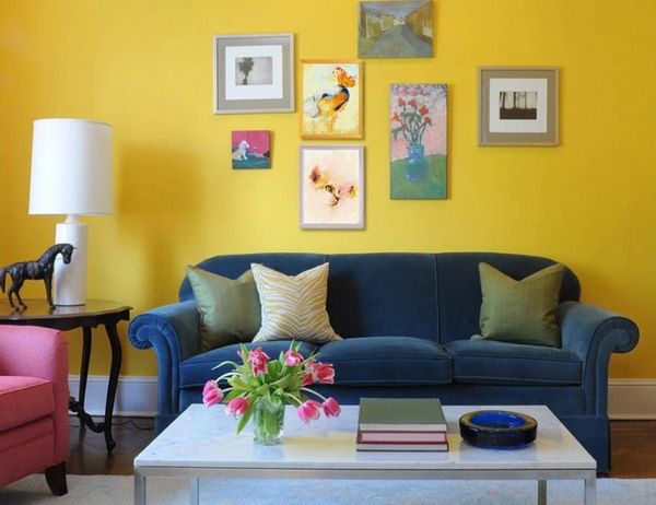
Yellow tones and always attracts maximum attention. Have you noticed that in supermarkets yellow is a trend for decorating various promotions, because price tags are distinguished by yellow? This is because the influence of yellow lies in everyone’s subconscious. Whether we like it or not, our brain cannot ignore this color.
Yellow tones and invigorates, especially during periods of moral fatigue and depression, which always comes to us at the end of autumn or during periods of psychological exhaustion. Being in a bright and sunny room, energy immediately appears, the view of difficulties changes, one wants to create, the necessary thoughts come to mind, and as a result, we feel and feel much better and more comfortable.
Yellow is conducive to trust, so it is often used in commercial establishments. Shops, offices, business offices, schools, kindergartens. There is also a downside. Too long an influence overloads the nervous system, so it is preferable to design the interior design of residential premises in soft pastel shades.
Green color of 2024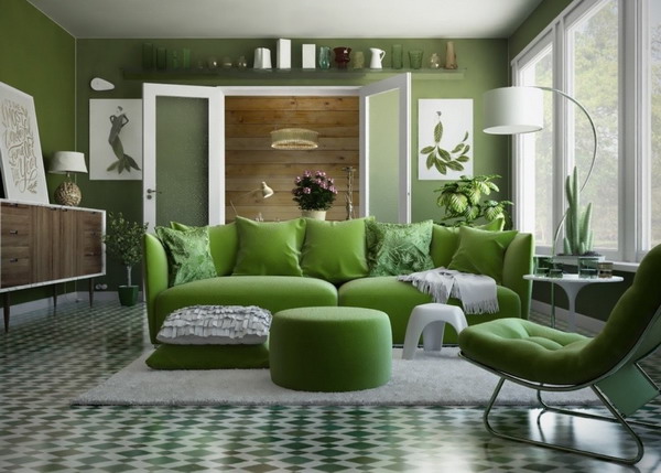
Green is peace and tranquility. This color evokes associations with nature, a leisurely lifestyle, bright and fresh emotions, and gives inspiration. Therefore, it has long been used in psychotherapy courses. Consider the effect on a person of various shades of green.
Coniferous evokes a feeling of reliability, stability and durability. They are chosen by people who have strong life principles and have high self-esteem.
The shade of moss evokes calmness and tranquility. It is chosen by romantic people with non-standard thinking.
Emerald improves tone. Gives energy and motivation to action. This shade is chosen by people who are self-confident and know their worth.
Light green acts too actively on perception and often irritates the nervous system. It is chosen by active people who like to communicate a lot.
Green is the color of 2023, mostly loved by many. About those who are his fans, we can say that they are bright personalities who like to express themselves. In the case when green is annoying – a sign of self-doubt.
Blue Color of the Year 2024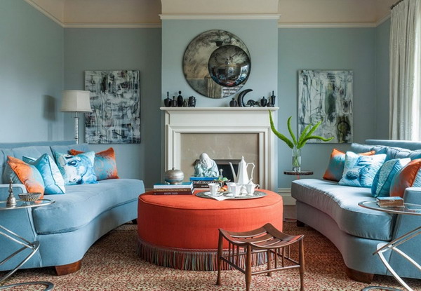
Blue is considered to be a calm shade that pacifies, increases concentration and performance. But it is worth knowing that this is not all the information. It turns out that the tonality of blue affects perception in different ways. The combination of blue and white is in different proportions. Any designer knows that lighter shades are perceived easily and carefree, inspire confidence, fill with lightness and cloudless thoughts. Darker tones cause apathy, depression, make perception heavier and tiring. Surrounded by such heavy tones, it is difficult to concentrate and work productively.
The shade of blue is chosen by people with a bright emotional mental organization. They are serious, but in the soul there is always a place for children’s enthusiasm and fun. Emotions constantly pull them from one pole to another. Now they are calm and cheerful, and in a minute they are covered with apathy and indifference.
Orange Color of the Year 2024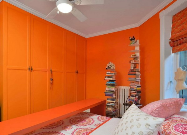
Orange is associated with joy, energy and warmth. In his power to dramatically improve the mood and create a festive atmosphere. Its properties in psychology include: creativity, striving for something new, activity, an optimistic outlook on life, vivid self-expression, high self-esteem and freedom from social boundaries.
In psychotherapy, orange is used as a remedy for depression. In small amounts, this color enhances the ability for logical reasoning. Encourages you to achieve your goals and live without looking back at obstacles.
A trendy orange hue is obtained by mixing yellow and red. A color with more yellow has a more calm and peaceful energy. Adjusts to the positive, as it is associated with sunlight. A shade with a predominance of red has more aggressive properties that give more energy, but at the same time overwork the perception. It stimulates the nervous system, so do not abuse it.
Brown color of the year 2024
Brown evokes in us a sense of earthiness, reliability, stability. It is inextricably linked with the protection of the family, support, a sense of duty and responsibility, prosperity and the accumulation of funds. Brown evokes associations of hearth and cozy evenings. Here’s what comes to mind when this color appears in the mind: coffee and tea, chocolate, bread, firewood near the fireplace, autumn leaves, cinnamon, a cozy warm blanket.
This color reminds us of warmth and comfort, good food and drinks, friends, friendship. The interior design, which has a trendy brown tint, is the embodiment of everything we strive for, what we expect from life, what we love and honor.
In psychology, brown has such properties as sincerity, honesty, diligence, diligence. At the same time, he is not intrusive, warm, calm and pacifying. In nature, brown is the most common, which means that we associate naturalness, freshness, light primitiveness and even luxury.
Pink color of the year 2024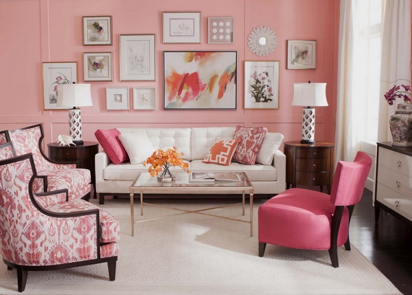
Pink on the subconscious is perceived gently and softly. It instantly reduces the aggressive mood and calms. With its help, they create a light atmosphere in the room, increase optimism and mood. Psychologists call pink an antidepressant. With its help, it is easier to part with negative memories and look into a bright, bright future.
In the properties of pink – to create a private environment. Often, it is this most popular color of 2023 that lovers use to decorate romantic dates. Balls, postcards, soft toys in this color are always saturated with tenderness and speak of tender feelings for a partner. In addition, it is able to awaken sexual sensations. Pink inspires confidence and extinguishes tension.
In the interior, this color evokes associations of freshness, peace, hearth, relaxation and celebration. Symbolizes spring and the beginning of a new life, swelling flower buds and pleasant dreams. As for relationships between people, pink gives inspiration, kindness, friendliness, tender feelings and romance.
White color of 2024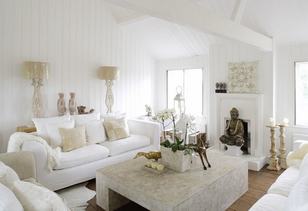
White is perceived as pure and benevolent. In the color scheme of the interior or wardrobe, designers rarely assign the main role to it, but it is always present. Due to its neutral coloration, which does not evoke emotions, it is an excellent background against which other shades appear more vividly. White brings harmony and peace, like an eraser, erasing everything bad from thoughts.
The properties of this color have been especially successfully used in advertising. White, being pure and innocent, evokes positive emotions. Of course, if it is correctly combined with other shades. You should not abuse it, because with its prolonged exposure to a person, apathy and depression may appear. White erases not only the bad, but also the good. Gradually introduces a person into a trance and a state of altered consciousness.
If you have ever been in hospitals where everything is white, remember how you felt. Sometimes this color even causes disgust, but only when it is too much and has too long an effect.
Gray is the color of 2024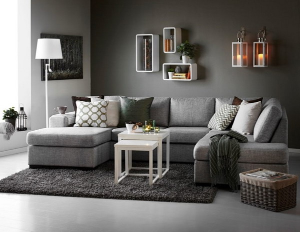
Gray has a calming effect on the human psyche. It absorbs all the negativity and increased excitability, helping to find a clear head without a fog of bright emotions. In addition, it contributes to the generation of constructive ideas when necessary. The trendy gray color of 2023 is used in offices, meeting rooms or in exam rooms. It helps to focus, become more calm and discard unnecessary worries.
Interior design and wardrobe in the style of English strict classics cannot be imagined without this color. It creates associations of serious deeds and right decisions, calmness and prudence. With it, they are protected from condemnation. It helps to become invisible, hide from prying eyes and the opinions of other people. People who love gray rarely draw attention to themselves. Do you know the expression “gray mouse”? This color on the subconscious does not attract attention and even turns on blindness. A person simply will not see this color, even if he is nearby.
Black is the color of 2024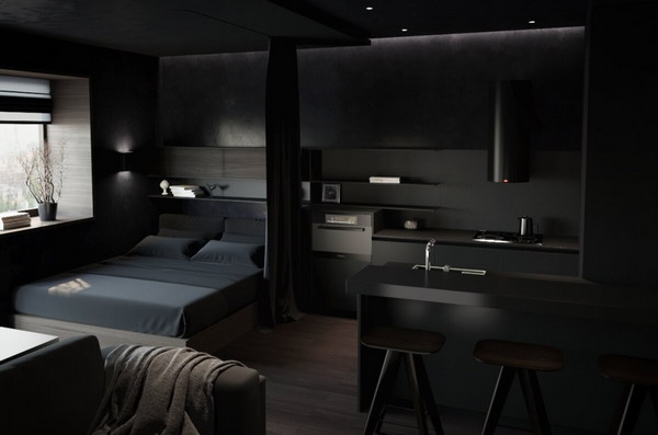
Black evokes associations of suffering, horror, grief and distress. He is a mystery and a mystery to everyone. It absorbs everything good and bad, leaving a void. If we talk about the wardrobe, then black is chosen by people who do not want to stand out. Such a psychotype is called an introvert. A person hides from everyone behind this mantle of tragedy and mystery. He is not afraid to be seen and judged.
On the other hand, if you combine it with bright colors, black is associated with luxury and wealth, prosperity and solidity. In its properties to transform and emphasize the entire color palette, because it is one of the neutral tones. So it is an excellent background for the artist’s canvas. Designers often use black in the interior and with its help they emphasize the exclusivity and special magic that is present here. Especially successful are combinations with a golden tone. In this case, hiding will not work. On the contrary, such a combination attracts maximum attention and receives admiration.
Peach blossom 2024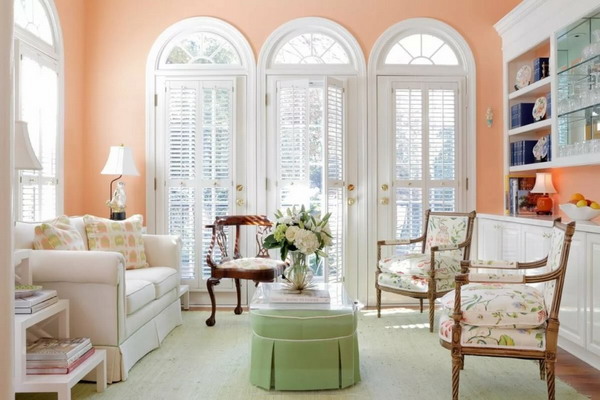
Peach shade is a mixture of orange, white and pink. Associated with a relaxing light atmosphere, it has a calming effect on the psyche and leads to a state of complete harmony. By the way, there are many shades of peach and each affects differently. If orange dominates in a combination of all three tones, the color will act more aggressively on the human psyche. It will tone you up, add energy, but in large quantities and for a long time it will irritate. In the case when pink dominates, the atmosphere will be calm, without sudden changes. Tender feelings and romance will pass through the entire interior, filling with comfort, warmth and awakening inspiration.
Peach hue varies in saturation by adding white. Get a more saturated and bright tone, or calm and pastel. This color is perfect for rooms that face north, adding warmth to a cold room.
Color ash shimo 2024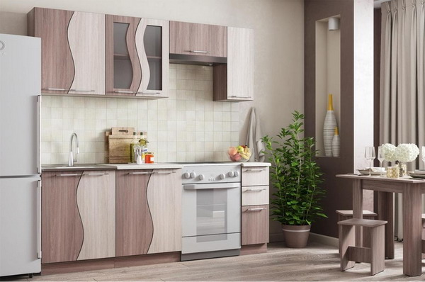
Today it is a very popular color and, in addition, it is a wonderful neutral tone that will suit the interior in a different color scheme. Shimo ash is actively used in fully built-in furniture compositions, kitchen sets, as well as on individual furniture elements in the form of a cabinet or coffee table. Many are confused by the name of this woody shade and it is difficult to imagine what it looks like. So let’s do a little description.
Shimo ash has two shades, light and dark. The light tone is reminiscent of delicious hot coffee diluted with milk. The dark shade, respectively, is described as coffee. As for the texture, this is a pronounced pattern of natural wood with clear veins that are inherent in natural materials.
Shimo ash brings nobility, light notes of elegance and grace to interior design. Due to the fact that there are two shades, they create surprisingly dynamic interiors filled with comfort and warmth of the hearth. By the way, this color is practical to use. No one will notice if the apartment was cleaned, say, last week, or maybe even earlier.
Aqua color 2024
The color of the sea wave is significant in the field of psychotherapy. It evokes associations of peace, tranquility, harmony and unity with nature. Under the influence of this color, it is easier to control the emotional state and focus on the important. As a result, the efficiency and speed of decision-making increases.
The trendy color of the sea wave develops creative thinking, its effect stimulates the areas of the brain that are responsible for fantasy and originality. In addition, the fresh tone of this color symbolizes the purity of the soul and thought. Maybe that’s why he has a positive influence when meeting or communicating with a person he likes. So take advantage of this effect, buy yourself a sea-green shirt or skirt and enjoy the effect.
There is also a downside to the effect of this color. Too long influence leads to apathy and indifference to everything that happens around. Sometimes the color of the sea wave is annoying, this happens in moments of extreme fatigue.
Ivory color 2024
The soft and delicate color of ivory is associated with luxury, elegance and grace. It is a darker version of white, in its properties – to visually expand the space in the interior, to give a clean and fresh look with a bit of mystery and warmth. The hue of ivory makes it easier to endure the difficulties in life, gives self-confidence and has a slight calming effect.
The color of ivory is different and at the same time its tones and differences are barely noticeable. It gives off in pink, yellow, green and gray. But in any case, it is warm, which fills the space with a mysterious atmosphere of home comfort, reminds of the positive moments in life and always reminds of cleanliness and freshness. This color is pleasing to the eye, which means you want to look at it for an infinitely long time, thinking about your own, sitting in an armchair with a cup of hot coffee near the fireplace. Soothing picture, right? The interior, as it were, is illuminated from the inside and gives off magical calmness.
Olive color 2024
Olive is soothing and calm. It has a positive effect on the psyche, conducive to communication, relaxation. Surrounded by this color, negative thoughts go away, it is easier to recuperate after a hard day. Olive belongs to the palette of green tones. Lighter shades evoke associations of youth, life, freshness. Darker ones – wisdom, maturity, experience of the past years.
In the interior, trendy olive symbolizes fidelity, mutual understanding and harmony of perception. Causes a feeling of security and reliability. As a rule, connoisseurs of this color have such qualities as conservatism. They are confident in themselves and in their social status, they will not make spontaneous decisions, but first they will carefully consider everything. In this regard, this shade is widely used in noble classical interiors, where natural materials of rare types of wood are used. Therefore, the olive shade is very fond of adults and mature individuals who achieve their goals, do not fuss. Business negotiations are held in a friendly atmosphere of warmth and tranquility.
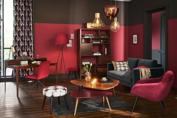
Burgundy Color of the Year 2024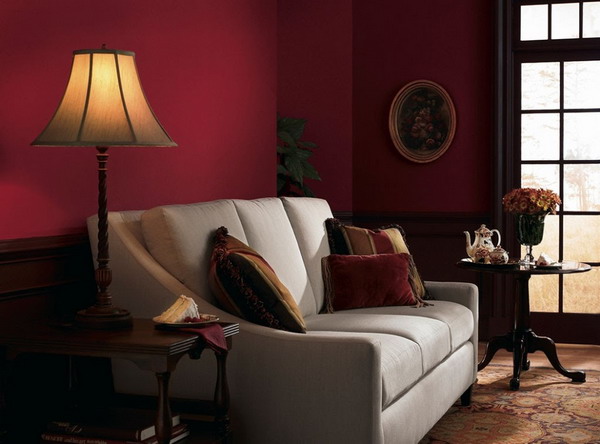
Burgundy is a dark and sensual shade of red. The color of attraction and seduction. From such a tone, the eyes get tired very quickly and the perception of the surrounding world plunges into a fog. It should not be used in places where an atmosphere of peace is required, in the offices of psychologists or hospitals. From prolonged exposure to burgundy, one often feels dizzy, pressure rises, and even the mood deteriorates.
This happens because burgundy causes tension in the nervous system. In this regard, it is not recommended to use it in the nursery, in the bedroom and in those rooms where rest and relaxation are expected. Burgundy is ideal where you need to create a festive atmosphere of fun and energy. It is a popular color in bars, clubs, boutiques, cafes. In these establishments, it is supposed to be active and burgundy will look appropriate and will not cause irritation. On the contrary, guests will feel comfortable and enjoy the cosiness of seductive and sensual Bordeaux.
Lilac Color of the Year 2024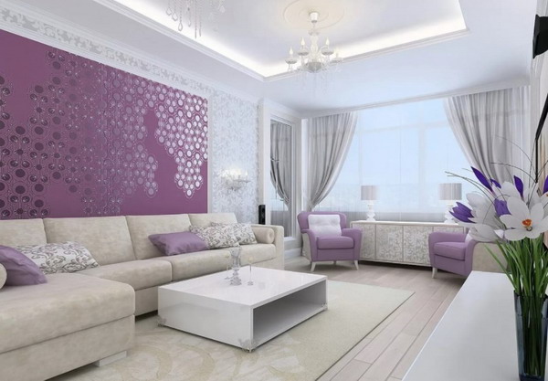
Lilac – a combination of blue, red and white, with a predominance of the first. This color is cold, but it looks gentle and romantic. In psychology, lilac evokes associations of mystery, imagination, creative thinking, sensuality and depth of emotions, romance and vanity, mistrust and alertness.
Lilac symbolizes the fusion of two principles, feminine and masculine. This means that this color suits both in equal proportions. Each designer will find in it the response of the soul. It induces a state of altered consciousness similar to meditation. A person under the influence of lilac plunges deep into his thoughts and falls out of the real world. Lilac encourages constant reflection and reassessment of existing values. If you begin to be drawn to this shade and the soul responds to its presence in your life, then you are on the verge of change. You do not know what to do and are looking for support and help, I am immersed in the magic of a lilac hue.
Marsala Color of the Year 2024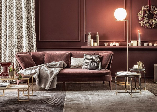
Marsala is an enigmatic and mysterious shade of burgundy. They are very close in mood and effect. But still, Marsala has its own distinctive features that distinguish it and distinguish it favorably. To begin with, let’s denote, in terms of color, this shade has a brown tone, which smoothly turns into burgundy. In our eyes, it looks simply magical and charming, because the eyes do not have time to find this edge and are in constant study. This means that the popular Marsala color attracts the eye and does not leave anyone indifferent.
People who like this color tend to be purposeful, respectable status, striving for elegance. They are self-confident, know what they want from life and successfully achieve it. Their life is predictable, it has stability and reliable support.
Marsala color is present in the wardrobe of adults and self-sufficient individuals who like to attract attention, but at the same time appreciate conservative views on life.
Ivory Color of the Year 2024
The psychological effect of ivory color can hardly be called unambiguous and predictable. The desire and love for this shade is regarded as an opportunity to hide in the calm, warm comfort of home and escape from the problems that arise daily. An apartment decorated in Ivory neutralizes all negative thoughts and emotions, relieves tension, anxiety and relieves heavy thoughts. With its help, they create a surprisingly soft, charming, cozy and mysterious interior, in which it is comfortable to be and immerse yourself in the utopia of your own thoughts.
An interesting property of ivory: in men and women it causes different associations and sensations. Men hardly notice this shade at all, it does not evoke any emotions and feelings in them. For their interior, it is chosen by strong personalities with iron self-discipline with old-fashioned views on life. Psychologists describe such men as: restrained, do not like spontaneity, value family and have strong principles.
For women, ivory is the door to a positive and peaceful world. The vast majority of the fair sex are positive about this shade. They are caring mothers and spouses, well-mannered and modest, do not like frequent changes and rarely attach great importance to their appearance.
Color fuchsia 2024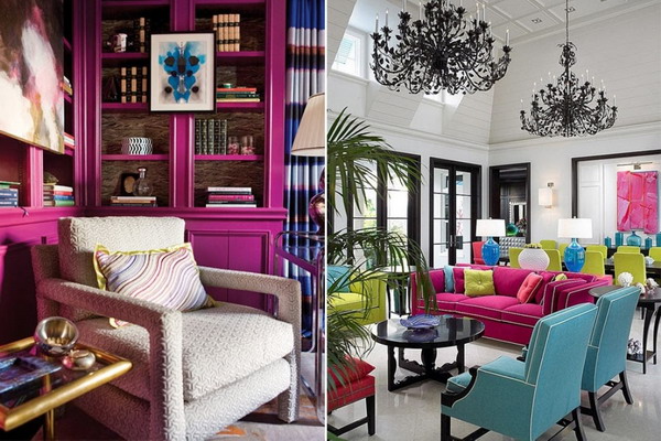
Fuchsia fills with positive and vital energy. This shade got its name from the flower of the same name, the petals of which have such a bright tone. It is generally accepted that fuchsia is intended only for those who seek to stand out and attract everyone’s attention. This is true, but people with conservative views on life have a soft spot for him. It improves mood and self-esteem, stimulates new actions and changes. In addition, fuchsia helps to focus your attention on the main aspects of life, set priorities correctly and not be distracted by minor events.
Under the influence of this shade, it becomes easier to reflect on serious and fateful decisions. This shade is also called the color of change. A person calms down, brings his emotions to a state of calm and thinks about everything that happens. And most importantly, find a way out. Therefore, if you suddenly began to like this color, think about it, maybe changes are knocking on your life.
Terracotta Color of the Year 2024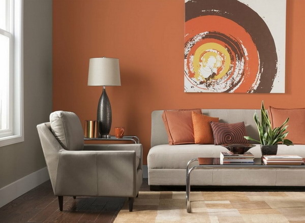
Terracotta evokes a feeling of stability, confidence and a solid foundation underfoot. It is associated with reliability, fidelity, looks solid and durable. It symbolizes calmness, harmony and ease of communication. However, you should not abuse and fanatically use terracotta in clothes and interiors in large quantities. Everything needs a measure. It perfectly complements the image, emphasizes the accents in the interior, but if you overdo it, terracotta causes the opposite effect – apathy and despondency, boredom and disappointment.
Use the properties of this color in small doses. For example, if you need to improve communication, wear a trendy suit of this shade or a raincoat. Terracotta is liked by persistent and purposeful people who are used to difficulties, but this does not stop them. They appreciate the warmth of the hearth, warm quiet evenings by the fireplace, the little joys of life.
Light green color of 2024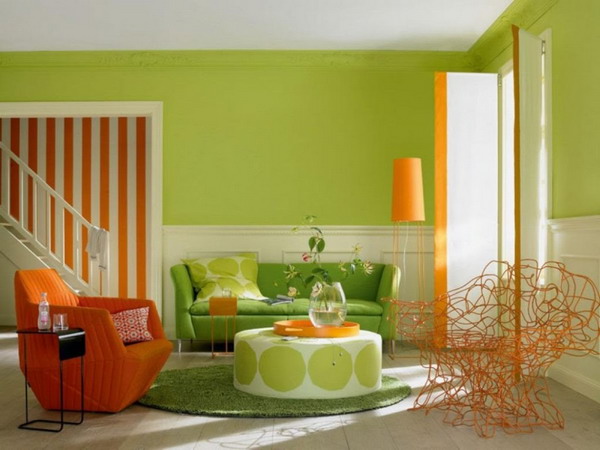
Light green is a shade of green, only lighter, brighter and more acidic. It calms, brings harmony and a clear look at confusing situations. Symbolizes the beginning of a new life and opens the inner doors to everything desired. Just be careful. In large quantities, it is deadly. It will irritate and tire, sometimes even lead to nervous breakdowns.
The thing is that it symbolizes cheerfulness without compromise. And it acts aggressively, causing rejection of our perception. Therefore, use it pointwise, quite a bit. For example, a small scarf in the wardrobe that will freshen up your look. In the interior, limit yourself to small accents. An apartment will look elegant, where there are chairs, curtains, vases, cute light green trinkets. Complement it with other colors from the spectrum of green tones and light green will fit perfectly and will play on your side. It will bring morale into tone and will always delight you. As a rule, light green shade is to the taste of sociable and carefree people who always see the positive in everything.
Wenge Color of the Year 2024
Wenge color has already become a classic interior design option today. And it’s well deserved. It got its name from the tropical tree of the same name that grows in Central Africa. This is an expensive, noble and exclusive type of wood that will wonderfully complement the interior in any style. Wenge received special love in home interiors. The apartment, furnished with wenge-colored furniture, in combination with natural materials of textiles and decoration, looks solid and dignified.
Also, the popular color 2023 wenge is trendy in modern interiors, where there is a minimum of details and a maximum of functionality. These are rooms in the style of minimalism, hi-tech, modern. It is especially pleasant that progress does not stand still and they have long come up with an analogue to this type of wood and have developed a budget material that imitates the structure of wenge. Thanks to this, anyone can bring nobility and solidity to their interior at a nice price.
Beige Color of the Year 2024
Beige seems to be a calm and almost neutral color, without much zest. However, if you look into the depths of the history of different cultures, you will find a lot of interesting facts. For example, in ancient times, beige was a symbol of death. When they saw off on their last journey, they dressed up in outfits of this shade. In India, it is the color of wealth. Previously, only wealthy and important people wore it. In ancient Egypt, beige was attributed to mystery and mystical secrets. The statues of the gods were painted with this color and it was believed that this made them closer to them.
The shade of beige is a quiet and warm color that cools aggressiveness, entails a trail of harmony and relaxation. Despite all its simplicity, any designer will say that this is one of the most complex and controversial tones. If you have a long impact on a person with this shade, there is boredom, withering, routine and monotony. Beige is able to deepen mental anguish and even aggravate old complexes. In large quantities, it dulls perception and causes inhibition in actions.
Sage color 2024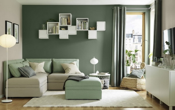
The color of sage is a shade from the color spectrum of greens. Dark and deep, has the appearance of dried medicinal herbs. Like all greens, this color evokes associations of cheerfulness, energy, and new life. Charges with good mood. But still there are other properties. This shade is difficult to perceive and it is difficult to guess the correct tone that will have a healing effect. Otherwise, it will cause aggressive depression, rejection of reality and a desire to quickly get rid of the spectacle of this color.
Therefore, it is carefully used in the wardrobe, and the desired shade approaches the noble tone of moss. It is rarely used in the interior, mainly to complement the spectrum of green tones and add originality. Many talented designers work with sage color flawlessly. If you are not confident in your abilities and do not know how and in what quantities to use this tone, it is better not to risk it. Leave it to the professionals.
Blue is the color of the year 2024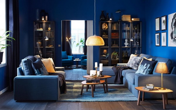
Blue color, depending on its shade, evokes a range of different emotions. From positive to strongly negative. For example, gentle blue brings calm, peace and helps to get rid of tension. This is a popular 2023 color of the year for decorating children’s rooms. The dark and deep tone of blue causes negativity and discomfort. Associated with danger and threat to life, when contemplated it becomes restless in the soul and leads to depressive thoughts.
A shade of blue combined with green evokes a sense of self-confidence. In another way, I call it turquoise. It encourages a person to achieve their goals, without looking back at the difficulties. It leads to a state of inner harmony and awareness of its significance. Turquoise helps to cope with your emotions and cool them down. If the designer chooses the right combination of different shades of blue, then they achieve not only a delightful appearance, but also inner harmony and tranquility.
Purple Color of the Year 2024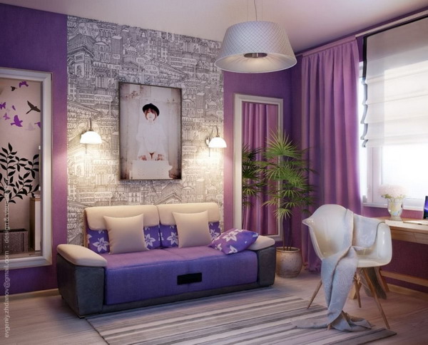
Purple is often found in nature and we are used to seeing it in our surroundings. These are berries and vegetables – plums, currants, eggplant. A lot of purple in the flowers that grow right on the street. Like lilac. In this regard, this shade evokes spring and summer motifs in the soul. A lot of sun, warmth and positive moments, which we really miss in everyday life. Violet symbolizes romance, mystery and magic of pleasant aromas that reveal new soul strings in us.
In the field of bioenergy, purple has a special meaning, it symbolizes a high frequency and connection with outer space. In ancient times, it was considered magical and possessing magical powers. In legends and fairy tales, all wizards’ robes and hats were purple. Members of the royal families also considered it unusual and noble and used it in their clothes. In addition, they forbade ordinary people to wear things with this shade.
How to choose a color in the hallway
The hallway is the first thing you see when you enter your apartment. And, of course, it will be nice if the apartment is decorated in pleasant colors. First of all for you, not for your guests. Many do not pay attention to this issue at all and in vain. After all, it won’t take long.
Decide on the style decision of the hallway, the choice of color palette will depend on this. Here are the most popular:
- Classic. This style is characterized by warm neutral tones: beige, sand, milky. A light haze of comfort will meet you at the very entrance and cheer you up.
- Minimalism. Basic colors: white, black, gray and cream. Here the emphasis is on contrasts. They create the main background and dilute it with accents of the opposite color.
- Modern. This is a universal trendy style that is suitable for any hallways and has no clear restrictions. It is performed in coffee tones. Shimo ash is ideal for decorating such a hallway. It comes in light or dark colors, but the main thing is that it creates a neutral background for perception. And good news for housewives, ash is practical, it will not show pollution, which is very often present in the hallway.
Please note that the walls are best decorated in a light shade compared to furniture. So the composition looks more harmonious and the space visually expands. Let’s be realistic, most hallways are tiny and this rule is very relevant.
When choosing a hallway color palette, pay attention to all the shades that are already there and that you can’t get rid of. This is the color of the front door, cashing, intercom handset. Look into the future and imagine how the outerwear of all family members hangs scattered. Imagine that vinaigrette and how it can be minimized by making the decision to choose the right color palette that doesn’t overpower the look of the interior.
How to choose a color for the bedroom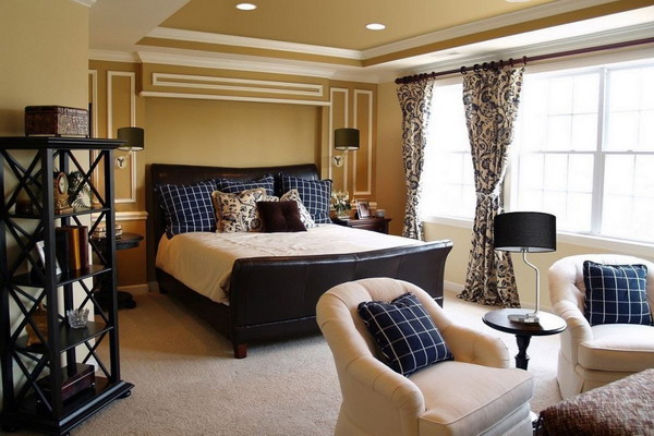
We know that the choice of colors affects our mental state. Therefore, for a room in which rest and recovery is supposed to be, this issue should be approached especially carefully. The appearance of the bedroom is a reflection of the soul of its owner, so you should listen to yourself and understand what color and decor you want to observe after waking up. What will cheer you up and will not unnecessarily overload the perception. In addition to personal preference, other factors should be considered:
- Room area. The larger it is, the more brightness and dark areas you can afford in interior design. Accordingly, in a small room it is worth giving preference to light and cool tones.
- Lighting level. The more artificial and natural lighting, the more bold and dark tones you can use, of course, if your soul so desires.
- Psychology and preferences. This point also applies to the general design style. The bedroom is made in shades that help to relax and rejuvenate, just for you, and not for people from the cover of a fashionable design magazine.
And now consider the observations of psychologists on the choice of colors for the bedroom. After all, often we ourselves do not know which color suits us best. Therefore, it is useful to hear the opinion from the outside. The following combinations are distinguished:
- Beige-coffee palette, a mix of gray and ivory increase efficiency and help to believe in yourself.
- Yellow-pastel, sand, orange palette give a charge of vivacity.
- Blue, cyan and green promote relaxation and give the effect of light coolness.
- The combination of white and beige relieves tension and helps relieve stress.
- Palettes in black, red, purple and pure white do not meet with positive recommendations from psychologists and designers. If you really like these shades, then do not use them in their pure form, combine, dilute and complement with other shades.
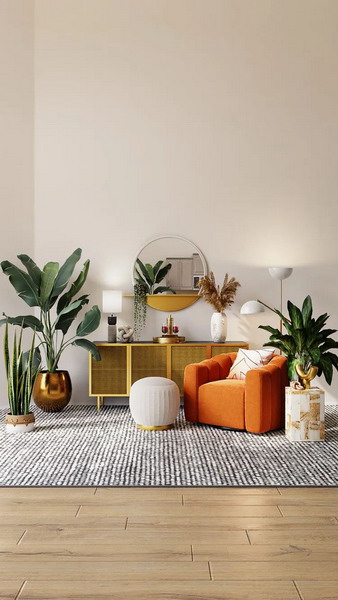
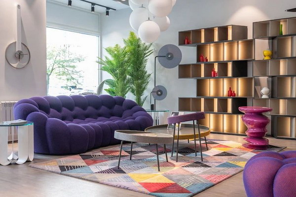
How to choose a color in the living room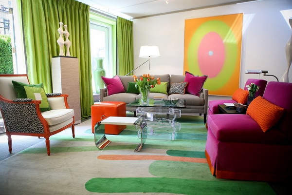
By tradition, the living room is considered the main room in the entire apartment. All family members gather in it after a working day, receive guests and enjoy relaxation and communication. The living room is done in colors that uplift the mood and contribute to a relaxed atmosphere. In order to realize such an interior, designers follow a number of simple rules.
An apartment in which the color scheme is correctly chosen visually looks wider, the space is filled with light, minor flaws will not be noticeable in it.
- Lighting. Diffused and dim lighting is offset by the use of light colors, with which the dark corners of the room are removed. If the lighting is bright and in excess, cool shades are preferred.
- The chosen style and the wishes of the owners. Each style decision has its own color palette. It is adjusted for each individual project, but the general concept still remains. In addition, this decision necessarily takes into account the preferences of future residents of such an interior.
- Functionality. It is no secret that with the help of color separate zones are distinguished, which makes the interior dynamic and lively. Thanks to this technique, they often refuse additional partitions that overload the space.
- Room area. The larger the room, the more space for the implementation of daring and bold ideas, the use of bright spots and unexpected color combinations.
There has long been a trend when the walls of the living room are painted in more than one tone. They take the chosen palette and in the darkest tone or, conversely, the light one focuses on one of the walls. The whole interior is built around it. This is the easiest and most effective way to spice up your living room and make it more interesting.
When choosing a color scheme, it is worth considering the side of the world, which the windows of the room face.
- South side. It is characterized by an excess of light and heat. Therefore, cool tones are used to reduce the degree and balance perception. These are white, blue, gray tones.
- Western side. The sun is especially active here during the day. It is recommended to use mint, deep blue, brown shades.
- East side. They prefer pink and brown.
- North side. The coldest and dullest side. Warm colors are chosen for the room: beige, coffee, sand, green.
How to choose a color for the work area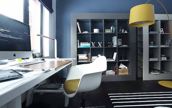
The choice of color palette for the work area is especially important. After all, it is on this that the working capacity and psychological state during work or the performance of lessons depends. Note that pastel colors have a particularly favorable effect and do not distract from the workflow. It is not at all necessary to be a professional designer in order to understand how to best and correctly arrange the work area. Several factors should be taken into account:
- Room area.
- The side of the world that the windows of the room face.
- The degree of illumination and the size of the windows.
In the case when the room has dim lighting, additional light sources should be added. For example, table lamps or sconces around the perimeter of the room.
If the room is “cold”, it is worth adding warm tones to the decoration. On the contrary, if the windows face south, dilute the interior with cold tones. You also take into account the colors of the furniture that are already there or are only supposed to be purchased. Ideally, it is done in neutral tones. For example, white or grey. While working, the focus is going on what needs to be done. If you add unusual color combinations and contrasts, the person in the subconscious will be constantly distracted, which means that performance will be much lower.
This does not apply to creative activities, where a share of creativity is required. If you need an inexhaustible source of energy and fresh ideas, bright colors and contrasts will help a lot. They will stimulate areas of the brain and nervous system, so that ideas will flow like water.
Let us turn to the observations of psychologists. How environment affects performance.
- Bright colors stimulate the nervous system.
- Decorative paints in unexpected combinations provoke overwork and even migraines.
- Calm shades increase concentration on the task at hand.
- For small rooms, cold shades are recommended. They make the space look bigger and help you focus.
- The combination of warm and cold tones has a positive effect on performance.
- Trendy green color 2023 is always in place. Especially if the activity is related to working on a computer. This shade has a positive effect on vision.
- Gray shades are calming, but at the same time people feel lethargic next to him and become lazy.
How to choose a color for the kitchen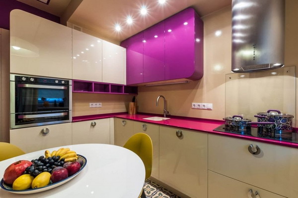
It is always important to consider in which room you plan to freshen up the interior. Each functional area has its own criteria. Of course, they intersect with the basic building rules that are used in any room. In particular, the color scheme in the kitchen is very important. After waking up in your magical and relaxing bedroom, you go to the kitchen for a hot cup of coffee. And this room is able to charge you with vivacity for the day or, on the contrary, lead to discouragement. Color power is high. Even if you do not immediately notice the effect, the daily ritual will do the trick.
Let’s start with the good news. There is no shade that absolutely cannot be used in the kitchen. But there are colors that are difficult to beat and fit into a harmonious composition. Therefore, the first step is to decide on a style decision. How do you see your ideal morning? Cozy and calm, original and bright or ultra-modern without unnecessary details.
The next step is to determine the color. This is where psychologists come in handy. After all, eating is an intimate moment, respectively, and the emotional background is created carefully, without excesses. Ideally, the interior will set you up for peaceful thoughts and will not make you want to throw out your negative emotions on the first person you meet.
Professionals stick to a light and warm palette for decorating the kitchen. They also recommend natural tones that will set you in harmony and peace. Such as green, blue, brown, wood textures. But not everything is so simple. There are subtleties:
- Orange, red and yellow. A small amount will increase mood and appetite. Just don’t overuse them. For example, they buy plates in such scales. They are not an eyesore and act locally only when you eat.
- Pink and grey. Helps reduce appetite. It is very useful for those who are constantly on the war line with extra pounds.