A paint color palette can be overwhelming. If painting is one of the simplest and most effective ways to transform any environment, colors can do the same with people’s moods. Hence, when choosing paint for the home, color is practically the only thing that influences the decision, as manufacturers know it well. Each year, they create their paint color palette proposals based on the main wall color trends identified globally.
After the last few years, emotions are on the surface, reflected in the ranges proposed by the different firms, which include tones designed to create serene and natural atmospheres for others that invite play and creativity. And it is that color expert comments on the occasion of the launch of its color chart for this year, “Colors influence our well-being. They can calm us down, ease our worries, or spark creativity.”
Nature-inspired Shades For a Cozy Home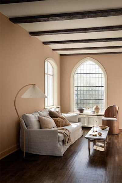
Natural tones are the protagonists of the Embrace range (the first of the three proposed by the catalog for 2024), which includes natural tones ranging from golden beige to earth or stone. They encourage us to slow down and land in the present, claiming simplicity as a refuge. The result is a soft, harmonious, and profoundly welcoming atmosphere, like the one in the image proposal, whose walls have been painted in a soft terracotta tone corresponding to reference 12179 Embrace.
The Triumph of Soft Tones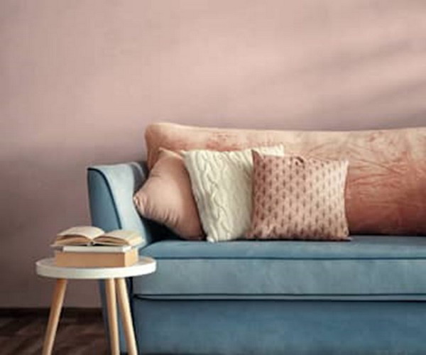
Pastel colors claim prominence this season as shades associated with emotions such as calm and comfort. They reflect the shared desire to achieve a balance between body and mind. Within this trend, Pinturas Montó stands out, above all, beige colors and beige with grayish tones, protagonists of their Wellness palette, which also includes colors like the one in the image, a dusty pink that they have baptized as Soft Makeup.
This Year’s Blue Has Ethereal Connotations.
If there is a star color in the chromatic range to convey harmony and serenity, that is blue. For 2024, this tonality, also from nature, is covered in mineral nuances, tenuous and almost transparent (softer until sky blue ), capable of imprinting tranquility and silence in any space.
An excellent example of this range is the shade Glassy Blue #E721, by Valentine, in the image used in this home office environment to reduce the stress that (forced) teleworking has brought to homes, but which is also perfect for giving a fresh and timeless note to bedrooms and bathrooms. A fashionable decoration detail is a pot in the shape of a head with the ‘hairs’ formed by a plant.
This is How the New Greens Are for Your Walls.
The seasons of forced confinement, bubble groups, and, in general, all the restrictions on our movements have made us appreciate nature much more, so it is time to bring greenery indoors. Studies show that selecting earthy shades of greens and mixing them with blues creates a relaxing and rejuvenating environment for both mind and body.
This combination is especially indicated in the bedroom, where we rest and revitalize ourselves since it will promote better-quality sleep. In this room, tones from Bruguer’s Greenhouse palette have been chosen, coordinating a warm shade of green with an almost translucent blue that gives way to a more intense one. The result: a corner of rest in the middle of nature!
Vibrant Colors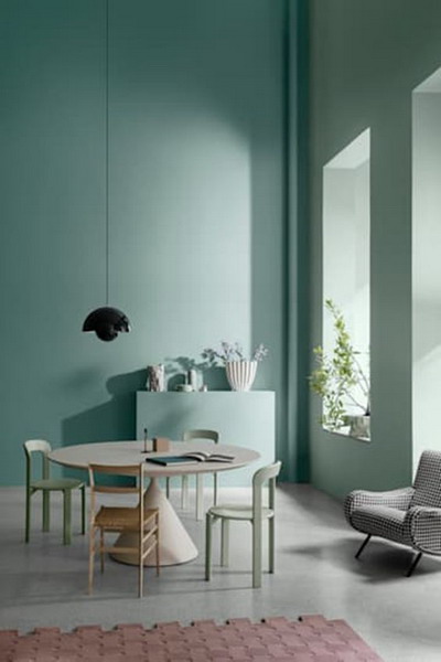
Another trend that has emerged due to the events of the last two years is the impulse to express ourselves with vibrant colors and personalize our homes with a note of drains.
Vivid tones without reaching fluorine (ofsignificantt visual impact), such as the fresh turquoise of reference 6384 Wish from Jotun’s Playful range (in the image), are perfect for creating spaces with high doses of creative energy without running the risk of falling into stridency. They can also be adapted to rooms where we spend long periods, such as dining rooms, lounges, or offices.
Bring Sunlight Indoors
The color yellow is raging today (because it has the incredible power to turn your home into a sunny retreat), and not only in decoration but also in fashion garments, accessories, and complements of all kinds. If we add everything it has to contribute regarding luminosity, it is unsurprising that it also stars in its paint palette. Of course, not just any yellow will do. Opt for energetic and cheerful shades, which multiply the sunlight, although in soft versions, such as mustard or the one in the proposal, the Buttercup color #E258, from Valentine, which, despite its liveliness, does not compromise the warmth of the rooms.
Put a Note of Creativity in Your Daily Life.
Purple tones, such as lavender or mauve, will significantly influence 2024 since they combine positive effects on creativity and productivity with their classic spiritual connotation. Let’s not forget that Pantone has ruled Very Peri, a vibrant, fresh, and punchy purple, as this year’s color (and the one on the walls of this Mobalpa kitchen ).
In addition, it is a very versatile palette since it can be combined with white, gray, or other neutrals to create contemporary and sober environments, as well as with more intense tones, such as green or yellow, to create vibrant and unusual corners.
Express yourself by mixing colors.
Any color continuously acquires new dimensions when combined with others that highlight or nuance it, as the case may be. Explore the effects of the juxtaposition of tones on the walls: if you bet on tones from the same palette, you will add a serene and elegant hue to the environment, while contrasting two or more different ones will produce a more dynamic and surprising result. It all depends on the effect you want to create and the emotions you want to convey.
In the proposal, a wall painted in Sage 3 (from the Luxens firm) appears in the foreground. Sage’s natural tones inspire Sage 3, and Leroy Merlin has designated it the color of the year for its ability to convey serenity and elegance. In the background, the wall painting is in an elegant and warm sand tone.