 Would you like to renovate your living room, bedroom or perhaps the entrance area and have not yet found the perfect wall color? Regardless of whether it is wall paint or wallpaper – for the personal character in your four walls it must now be innovative colors. We’ll tell you what to look out for when choosing a wall design. Be curious and browse through our guide for the ideal wall color to beautify your room. Here are our favorite wall paint ideas and tips!
Wall colors and their effects
It is known that colors affect our mood. This is exactly why you should think carefully about which room you want to design with which wall color. Of course, everyone is different and has their own favorite colors. Perhaps our trend overview will also help you decide.
- White: White is ideal for the hallway or small rooms. The calm and clear atmosphere offers the perfect basis for every styling and every furnishing style!
- Gray: The neutral, timeless color brings warmth into your home. Can be perfectly combined with natural materials!
- Green: Thanks to the calming, balancing and refreshing properties, a green wall paint is perfect for the bedroom, kitchen or hallway. The noise-dampening properties of the color create a particularly harmonious oasis of wellbeing.
- Yellow: Yellow walls remind us of sun, summer and the beach. They make your home shine and radiate a warm feel-good atmosphere. In addition, yellow wall paint is an absolute all-round talent and can be combined with many other tones.
- Blue: The calming and relaxing blue is perfect for your bedroom but also for the study. It promotes concentration and looks outrageously chic!
- Rosa: Not just for little girls! Pink is the color of love and passion and perfectly underlines the feminine classic look.
- Beige: Beige looks cozy and brings light and warmth to any room. The perfect companion for furnishing in shabby chic or country house style !
These are the color trends of the season
In addition to the classic wall colors, unusual tones also become absolute trend wall colors! So a soft and spring-like wall color in pastel is a must-have for all interior fans. Or they decorate your walls with the wall color gold and thus create a glamorous look. Other modern wall colors are:
- Petrol: The rich blue-green is also becoming increasingly popular in our walls and ensures warmth and comfort. With the right color combination, the trend color becomes an absolute highlight and gives the room an extravagant touch in no time.
- Terracotta: The Mediterranean color is reminiscent of summer, sea and beach. Especially in combination with nude tones, the brown chimney red looks great in the living room and bedroom.
- Turquoise: Turquoise is the color of the sea and ensures freshness and lightness in your home. Since it belongs to the blue color palette, it also has a calming and soothing effect on us.
- Black: Black wall paint is currently very trendy and we simply cannot have enough of it! The elegant non-color can be wonderfully integrated into the furnishings and becomes an absolute eye catcher on the walls.
- Altrosa: Mellow, tender, romantic – the trend color dusky pink radiates positivity and affects us soothingly. It is also a true all-round talent, as it can be combined with many other colors and various living styles.
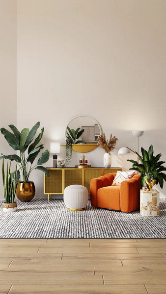
Wall paint ideas for all rooms
It is not only the effect of the wall color itself that plays a major role in interior design. If you want to upgrade your walls with a new color, you should always consider how the respective room is used. Are you still looking for inspiration for wall paint ideas in the living room, bedroom & Co.? Our interior experts have put together the best living ideas for every room for you!
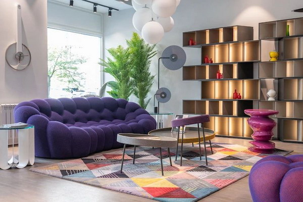
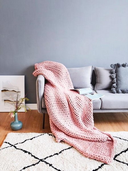
Cozy wall design in the living room
The living room is a place of rest and relaxation, but also the center of fun evenings with family or friends. Since the wall design in the living room contributes significantly to the atmosphere in the room, you should consider the choice of living room colors extremely carefully. The focus here is definitely on cosiness and a cozy feeling of wellbeing. In fact, this can be done with the right living room wall color.
Our favorite: blue – the star in the living room
Blue, blue, blue are all my walls! From the bright electric indigo to a greenish petrol blue – we break conventions! Be a free spirit and really showcase your living room walls with shades of blue! You can match the room with carpets and accessories in contrasting colors such as yellow or black and white. Velvet textiles also underline the elegant look.
But why paint the walls in blue? Although blue may seem too powerful for many interior fans at first glance, the most diverse shades of blue create a balancing and harmonious mood. The ideal basis for beautiful living rooms ! Especially in combination with solid wood or rattan furniture, such a room comes into its own.
Practical wall design in the kitchen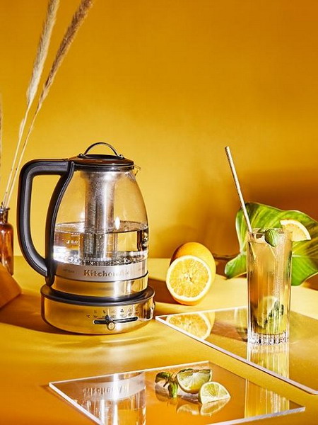
A place where people laugh, argue, cook and enjoy – the kitchen! As diverse as the room is, the wall design in the kitchen should also be practical. Because especially by preparing delicious dishes, splashes and grease stains on the wall can sometimes not be completely avoided. This is only annoying when the stains can no longer be removed. Therefore, in addition to design, you should also focus on functionality in your kitchen. Washable wallpaper or particularly insensitive colors at the hotplate are the perfect solution. On top of that, the wall color in the kitchen should also match the existing furniture and complement each other ideally.
Our favorite: summer, sun & sunshine in the kitchen
Yellow in the kitchen? Exactly! Yellow is the color of wisdom and summer and has a strengthening and inspiring effect. Yellow makes everything much friendlier and makes the viewer cheerful. In addition, yellow walls in the kitchen have an inviting effect.
Let the sun shine in and enjoy the pleasant atmosphere of fruity lemon yellow, exotic saffron yellow, earthy ocher or a noble golden yellow. They work perfectly with rustic wooden furniture in brown or in light cream tones!
PS: For the kitchen, the use of blackboard paint is also very practical. Skilfully used, it can be a real eye-catcher and used by all family members. Children can use the board to draw. But it is also perfect for daily shopping lists or other notes. Tip: The frame of a large picture frame shows the surface of the blackboard in a stylish way.
Soothing wall design in the bedroom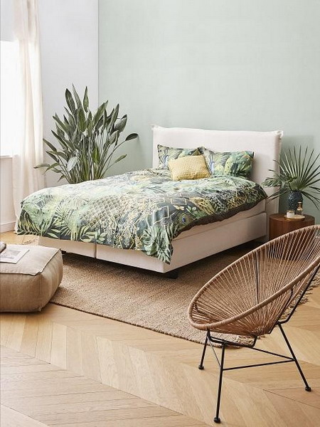
The bedroom is the undisputed haven of peace where we can relax after a stressful day at work. Did you know that we spend around a third of our lives in bed? This fact alone shows that the ambience in the bedroom also plays a major role in relaxation. Of course, this also includes the wall design with the matching wall color in the bedroom !
Our favorite: Fifty Shades of Green in the bedroom
A green bedroom? No, that’s not a joke! In fact, the wall color green is a pretty good choice for your bedroom. Even if you wouldn’t suspect that at first. Green is the color of nature and has many facets. There are numerous variations from fir and moss green to a bluish turquoise or a refreshing apple green to a delicate white green. So it doesn’t have to be the poisonous frog green.
For the best feel-good character in your bedroom, you should choose a more subdued shade of green, such as forest green. The individual nuances are often provided with certain undertones. So despite the striking wall design, the room still looks harmonious and modern.
Tip: combine the shades of green of your choice with furniture made of light wood or rattan. Round off the overall picture with delicate cream or beige tones. Green bedroom colors may not be for everyone, but they definitely deserve a chance.
Maritime wall design in the bathroom
Ahoy sailors! Which wall design fits better in the bathroom than our permanent favorite: the maritime look. To take one thing straight away: a bathroom in a maritime style doesn’t have to be kitsch. It depends on the interplay of colors and decoration. You shouldn’t use too much or too little here. The golden mean is not only the right way, but also provides security, calm and elegance in this case. Wall colors in blue, green or pastel tones are particularly cool in the bathroom. But even more extravagant tones like red or black are currently very trendy.
Our favorite: gray elegance in your bathroom
A bathroom can be wonderfully painted in different shades of gray. It is up to you whether you stick to a shade of gray or vary between several. However, since the color has a neutralizing effect, accents can be very nicely set with a selected color. If the simple and elegant style is to be maintained, color accents in brown or beige are suitable. Scented candles, mirrors and beautiful color-coordinated towels and bath rugs make the overall impression perfect.
One should be careful with small bathrooms. Because here the room can appear overwhelming due to the wall color being chosen too dark. Rooms that have little incidence of light are particularly affected. That’s why the following applies: Use lighter wall colors in small rooms!
Happy wall colors for the nursery and baby room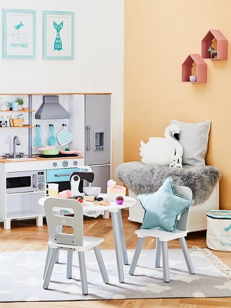
Happy wall colors in the children’s room are absolutely trendy! These no longer have to be gender-specific. Instead, opt for a neutral children’s wall color like gray. Then customize the room with colorful accents and home accessories. This could be a carpet, curtains, bright boxes or something similar. Green is also an excellent nursery color because it creates the perfect balance between stimulation and relaxation. Subtle natural tones also radiate warmth and security and are therefore ideally suited for children’s rooms.
In the baby room you should also use simple and reserved nuances. Especially blue or a light purple have a soothing effect and promote the development of the child positively.
Our favorite: Tender apricot to relax in the children’s or baby room
Did you know that apricot is the color that babies in the womb perceive first? For this reason, the delicate orange tone has a particularly relaxing and pleasant effect on the little ones. But apricot-colored walls also look good in the children’s room. In combination with white or cream colors, they create a warm and cozy atmosphere. The kids are guaranteed to feel good here!
Inviting wall colors in the hallway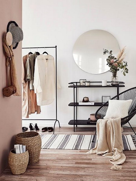
In the hallway, the wall design should be one thing above all: friendly and inviting. Especially with light colors you can create an ambience that welcomes you and your guests. Since these visually widen the space, you create an open atmosphere in the hallway. White and cream, but also delicate pastel shades are real color classics here. If space permits, stronger and darker tones also cut a fine figure. These look a little mysterious and make the overall picture appear elegant and cozy.
Our favorite: naturally beautiful hallway with sand colors
You want to make your hallway bright, open and friendly, but the color white is too monotonous for you? No problem! Delicate natural tones such as beige, caramel or sand are just as reserved as wall colors in the hallway and visually enlarge the room. At the same time, in contrast to white, they appear significantly warmer and create an inviting and cozy atmosphere. In addition, the subtle nuances bring furniture and accessories to their best advantage.
If you want to emphasize the warm look, elements made of natural materials are just perfect. Accents in gold skilfully round off the overall picture and exude an elegant flair in your four walls.
A little tip: Would you like to design your staircase with wall paint? Then choose a simple color such as gray, beige or dark blue or red. Here you can also choose a color design halfway up or from individual walls.
Cozy wall design in the dining room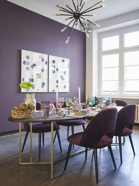
The color of the wall in the dining room not only influences whether we can feel good and relax in the room. Did you know that wall design can also make sure we eat a lot or a little? The appetizing colors include, for example, red, orange and yellow. These have the plus point that they have a warming and activating effect on us. Color tones like blue or violet curb the appetite. But they are by no means less fitting in the dining room! Thanks to their concentration and communication-promoting properties, they are ideal for lingering over a nice dinner.
Our favorite: Pure luxury through violet in the dining room
Your dining room will be extravagant and luxurious with a wall color in violet or purple. The dark color exudes a noble elegance and scores with a positive charisma. So that the overall picture does not appear too overwhelming, it is best to paint only one wall in the Naunce. With the help of dark wooden furniture and color-matched home accessories, you can underline the striking look of the wall color. This makes the dining room look modern and elegant. Bright colors also go well with this. These take the weight off the wall paint and provide a little lightness in your home.
Motivating wall colors in the study room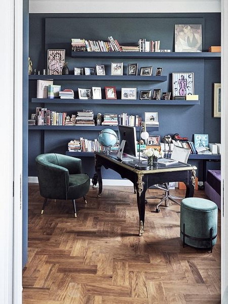
The wall color in the study should also be selected carefully and carefully. Are you more the creative type? Then warm wall colors such as red, yellow and purple are a good choice because they have an activating and inspiring effect. For those who long for relaxation and calm in the office, cold shades like blue and green are simply excellent. Regardless of which wall color you choose in the office – the important thing is that you create a homely atmosphere in which you can feel comfortable and concentrate on your work.
Our favorite: just cool! Wall color petrol in the office
Your study will be particularly cozy and cozy with the petrol wall paint. The dark shade has a harmonious appearance with a neat trace of elegance. It has an invigorating effect on us and promotes concentration – the perfect basis for an office. Since the dark azul blue is cool, it is also great for small rooms. So that the study does not appear too overwhelming, you should leave the ceiling lighter.
You should pay attention to this when designing the wall
Are you planning to paint your walls? There are a few points to consider in advance:
- Fact 1: Dark tones make a room appear smaller and narrower. For this reason, it is better to use a dark wall color only as an accent color for now.
- Fact 2: Light wall colors such as white or powdery and delicate pastel tones are perfect for small rooms. They make the room appear larger and more open.
- Fact 3: Warm wall colors are ideal for everyone who wants to bring a good dose of warmth and cosiness into their four walls. They convey a certain stability and have a calming effect on us. They also make the walls appear a little closer and are ideal for large rooms.
- Fact 4: Think about what effect your walls should have – cool, elegantly playful or rather cozy? Then select the appropriate wall color.
- Fact 5: The beautiful wall design does not only include brushes and paint. Wall decorations such as pictures, mirrors or clocks as well as furniture and textiles also influence the ambience and have a different effect depending on the wall color. Unless you are planning a large-scale remodeling, you should always include the previous interior in your decision for a wall color.
Which wall colors go together
In order to put every room in the limelight, you should consider in advance which color suits. Match the wall color (s) to your furniture, decoration and textiles and create a harmonious feel-good atmosphere. If you would also like to combine different wall colors with each other, you should also pay attention to which ones fit together. The chosen nuances and color combinations have a considerable influence on the effect of the room and your style of furnishing.
Color wheel and color harmony
Before you start your new renovation project, you should familiarize yourself with the basics of color theory. And that’s not that difficult!
The individual hues are arranged in the so-called color wheel. These are divided into primary, secondary and tertiary colors. The primary colors include red, yellow and blue. The secondary colors are mixed from these three shades and result in orange, green and violet. Everything in between is called tertiary or spectral color.
If you now want to combine different shades, this can be either harmonious or high-contrast. The overall picture becomes harmonious if you mix colors that lie directly next to each other in the color wheel. You create an exciting contrast when you combine shades that lie opposite each other in the color wheel. These nuances are also called complementary colors.
The most important questions about wall paint
Does Westwing advise on wall paint?
If you book an interior concept through our Interior Design Service, your designer will of course also be happy to advise you on the subject of wall paint.
How long does wall paint last?
Many manufacturers specify a shelf life of around two years for their colors. However, this information applies to the unopened condition of a wall paint. A high-quality color usually lasts significantly longer than specified.
Which wall color best covers?
Before you finally paint, ask yourself: Which wall color best covers? After all, white is not the same as white! To ensure that your colored wall gets the perfect coat of paint, you should treat the surface with a white emulsion paint. A single coat of paint is usually sufficient here and the wall shines in flawless pure white.
How long does wall paint have to dry ?
Depending on the surface and the environment, the drying time of the wall paint also varies. Color dries faster in warm, heated rooms than in a cool environment.
A little tip: Your wall paint dries particularly well in well-ventilated rooms! Therefore ventilate again and again. In general, most wall paints take a maximum of five hours to dry after one coat. However, it is best to let the wall paint dry overnight.
Can I mix wall paint myself ?
Indeed, you can! Many hardware stores offer a color mixing service, but with our guide you can easily do it yourself. This not only saves you money, you can also create your own individual tone.
From sponge to wiping technique: the most beautiful painting techniques
Brushing, dabbing or wiping – there are numerous painting techniques and painting ideas that you can use to beautify your four walls. The classic method is to apply with a paint roller. For a special look, you can also use a brush to paint rough effects in the color.
The sponge technique also ensures an interesting play of colors on your wall. With an effect roller you get an effective pattern of noble transparency.
The modern wiping technique: step by step to the new wall look
- First paint the wall in the color of your choice.
- Now put part of the glaze into a paint tray and wet it with the effect sponge.
- Squeeze the sponge gently so that it doesn’t soak up. Then spread the glaze in small lines in a cross shape on the wall.
- Use a flat brush and optimize areas that are too structured.
Wall paint ideas: DIY geometric wall pattern
Are you still looking for an exciting DIY project for your wall? Our interior experts will tell you how it’s done!